


Line-Graph
Description
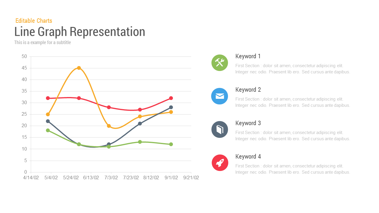
Visualize multi-variable performance trends with this clean, dark-themed Line Graph Analysis template. The left panel showcases a multi-line graph plotting data over ten intervals, each line in a distinct color (yellow, red, blue, green) for immediate visual separation. On the right, four corresponding color-coded keyword blocks summarize each dataset with iconography and placeholder descriptions—ideal for explaining fluctuations, KPIs, or comparisons. The chart’s dark background enhances legibility, while the simple layout focuses attention on data interpretation. Easily customizable, this slide helps you present business metrics, financial reports, or user behavior insights clearly and professionally on PowerPoint and Google Slides.
Who is it for
This template suits data analysts, business consultants, financial officers, and marketing strategists who need to present comparative line trends efficiently. Educators and researchers can use it to display experimental or historical data, while project managers can illustrate timelines or metric changes across phases.
Other Uses
Repurpose this layout for customer satisfaction tracking, website performance reviews, or budget variance analysis. Replace icons and labels to convert it into a project milestone tracker, product growth report, or multivariate process comparison. The flexible color-coded legends ensure clear storytelling across industries.
Login to download this file

Item ID
SB00059