Pie Chart Hierarchy Infographic for PowerPoint
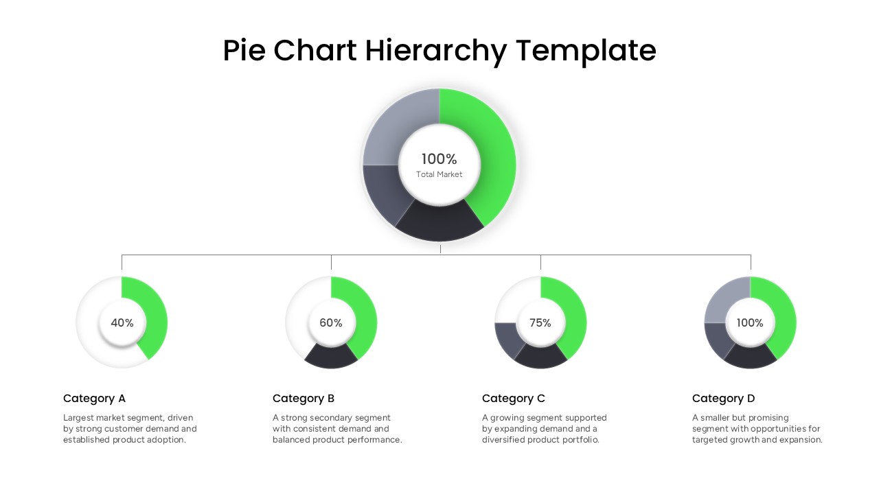
Are you looking for a simple way to explain how different categories contribute to an overall market or business structure? Our Pie Chart Hierarchy PowerPoint Template offers a visual approach for presenting proportional data through connected donut charts. Instead of displaying multiple statistics in isolated charts, this layout establishes a clear relationship between the complete market and its individual categories. It can help business professionals communicate segmentation data, portfolio composition, customer groups, product categories, and other percentage-based information in a presentation-friendly format. The organized visual flow allows audiences to understand the relationship between the whole and its underlying segments without relying on lengthy explanations.
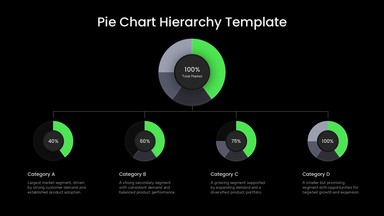
The Pie Chart Hierarchy PowerPoint Template contains the professionally designed slide featuring a central donut chart and four connected category-level donut charts. The main visualization displays 100% Total Market and serves as the starting point of the hierarchy. A horizontal connector branches from the primary chart toward four supporting visualizations positioned across the lower portion of the slide. Each category chart displays a percentage value and is paired with a dedicated heading and descriptive text area.
The percentage indicators can be changed to represent actual business figures, while the text sections can be customized with insights, observations, or descriptions for each category. This structure makes the slide applicable to market segmentation, competitive analysis, sales reporting, product portfolio reviews, customer analysis, business strategy, and financial presentations. Presenters can also use the hierarchy to demonstrate how a broad dataset is distributed across several contributing areas.
Visually, the template combines donut-style pie charts, connecting lines, percentage labels, bold category headings, and supporting descriptions on a spacious white canvas. The contrasting chart segments create visual separation between the different portions while maintaining a consistent presentation style. All elements are fully editable in PowerPoint, allowing users to adjust chart values, replace category titles, rewrite descriptions, modify typography, and customize the visual appearance to suit their brand or presentation theme. Use this Pie Chart Hierarchy PPT slide to turn proportional data into an easy-to-follow business story and create a more structured data presentation. Download it today and customize the layout for your next presentation.
Frequently Asked Questions
Can I edit the percentage values and category labels in this template?
Does this template work in Google Slides as well as PowerPoint?
Login to download this file

Item ID
SB06345Designed By
Naseeba Sithara


Related Templates

3D pie chart infographic template for PowerPoint & Google Slides
Pie/Donut
Segmented Pie Chart Infographic with Icons for PowerPoint & Google Slides
Pie/Donut
Free 3D Pie Chart PowerPoint Template & Google Slides
Pie/Donut
Free
Business Opportunity PowerPoint Pie-Chart Template
Pie/Donut
Gear Pie chart PowerPoint Template
Pie/Donut
Pie Chart with Social Media Market Share PowerPoint Template
Pie/Donut
Bar of Pie Chart PowerPoint Template
Pie/Donut
Demographic Pie Chart PowerPoint Template
Pie/Donut
Car Companies Sales Pie Chart Template
BCG

Four Keys Hierarchy Chart PowerPoint Template
Process
Five-Branch Hierarchy Structure Chart template for PowerPoint & Google Slides
Org Chart
Horizontal Hierarchy Chart Template for PowerPoint
Org Chart
Horizontal Multi-Level Hierarchy Chart template for PowerPoint & Google Slides
Org Chart

Multilevel Hierarchy Organization Chart template for PowerPoint & Google Slides
Org Chart
Organization Hierarchy Chart Template for PowerPoint and Google Slides
Org Chart
Organizational Structure Hierarchy Chart for PowerPoint
Org Chart
Modern Organizational Chart Hierarchy Template for PowerPoint & Google Slides
Org Chart
Corporate Hierarchy Org Chart Template for PowerPoint & Google Slides
Org Chart

Sales Organizational Hierarchy Chart Template for PowerPoint
Org Chart
Horizontal Hierarchy Organizational Chart PowerPoint Template
Org Chart