NPS Dashboard PowerPoint Template
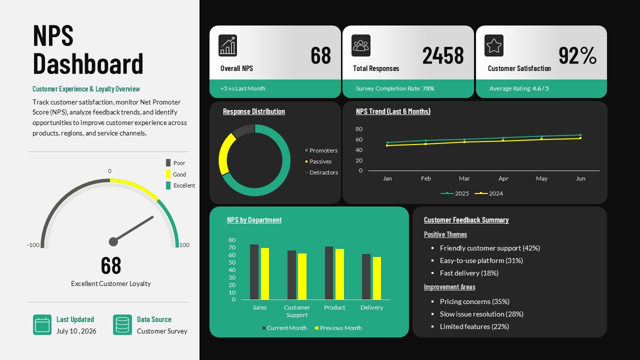
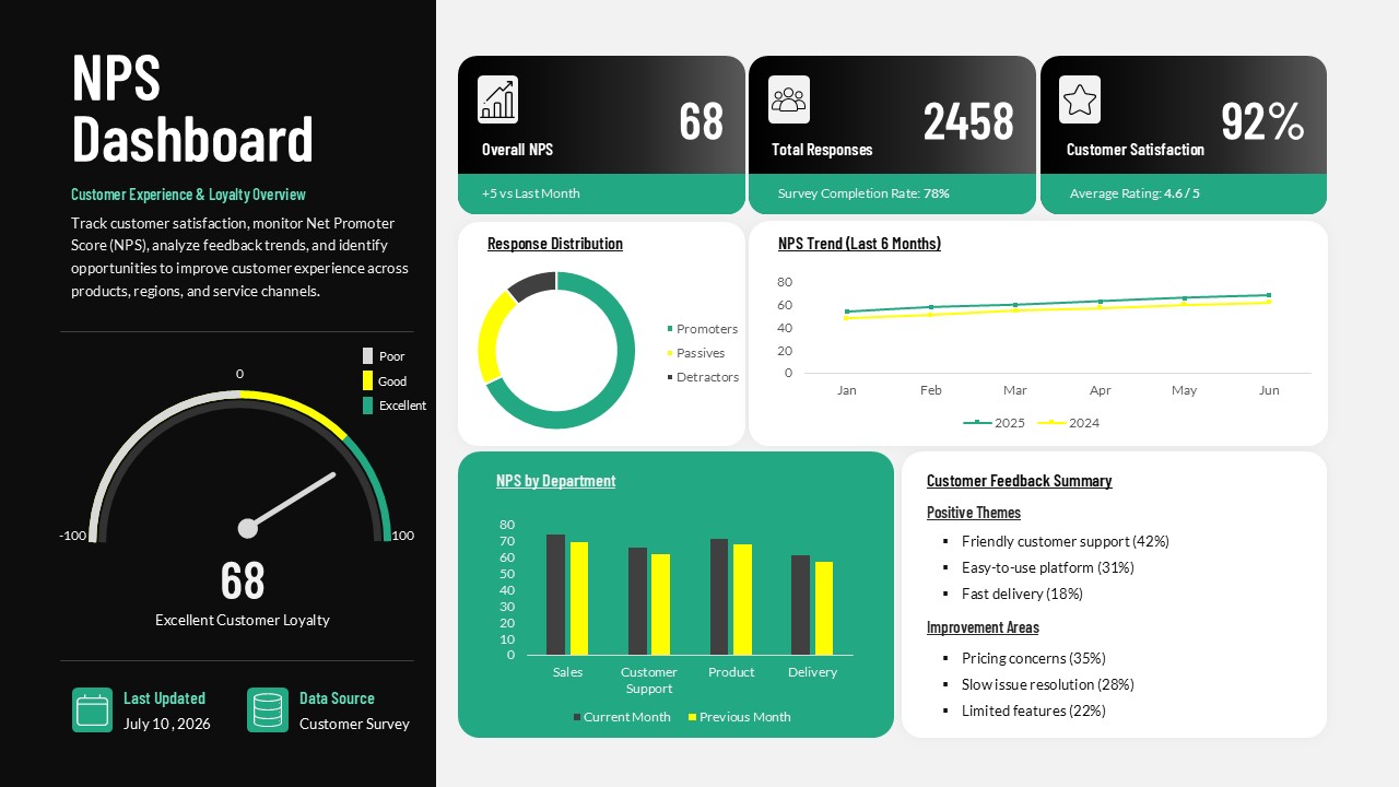
The NPS Dashboard PowerPoint template is a data visualization slide for teams who need to present customer loyalty and satisfaction metrics in one place. The slide combines a Net Promoter Score gauge, a response distribution donut chart, a six month trend line, a department comparison bar chart, and a feedback summary panel with positive themes and improvement areas. A header block displays overall NPS, total response count, and customer satisfaction percentage, giving viewers the top level numbers before they move into the supporting charts.
The layout is built as a two panel design, with a dark sidebar on the left holding the NPS score, gauge, and data source details, and a grid of chart panels on the right. Two color variants are included, one with a dark sidebar and light chart panels, and one with a light sidebar and dark chart panels, so the slide can match either a light or dark presentation theme. Every chart, number, label, and icon is a fully editable PowerPoint object, and the gauge, donut chart, line graph, and bar chart are all built with native chart data that can be updated directly in PowerPoint.
Net Promoter Score is a customer loyalty metric calculated from survey responses that group customers into promoters, passives, and detractors. Customer experience teams, product managers, and customer support leads use an NPS dashboard slide like this one to track score changes over time and identify which departments or touchpoints need attention. Download the NPS Dashboard PowerPoint template and edit it now. For more designs, check our collection of dashboard PowerPoint templates.
Frequently Asked Questions
Can I edit the data and charts in this NPS Dashboard template?
What can this NPS dashboard template be used for?
Login to download this file

Item ID
SB06282Designed By
Niranjana


Related Templates

CSAT vs NPS Comparison template for PowerPoint & Google Slides
Business Strategy
Sales Dashboard Template for PowerPoint Template
Bar/Column

Project Management Dashboard PowerPoint Template and Google Slides Template
Project
Immigration Data Dashboard Template for PowerPoint & Google Slides
Bar/Column
Social Media Performance Dashboard Template for PowerPoint & Google Slides
Bar/Column
Project Status Dashboard Template for PowerPoint & Google Slides
Project Status
Free Metro UI Template
Business Report
Free
Cost Cutting Savings Dashboard Template for PowerPoint & Google Slides
Pie/Donut
Quarterly Financial Summary Dashboard Template for PowerPoint & Google Slides
Business Report
Project Tracking Dashboard Table Template
Project Status
Action Items PowerPoint Template
Project Status
Electronic Health Records Dashboard Template
Health
Account Overview PowerPoint Template & Google Slides
Business
Project Status Dashboard Report Template for PowerPoint
Project Status
Project Status Template for PowerPoint
Project Status
LinkedIn Reporting Dashboard Template
Digital Marketing
4DX Scoreboard Dashboard for PowerPoint & Google Slides
Business Strategy

Quarterly Financial Report PowerPoint Template
Finance
Web Analytics Dashboard Template
Business
Editable Workforce Management Dashboard PowerPoint Template
Dashboard