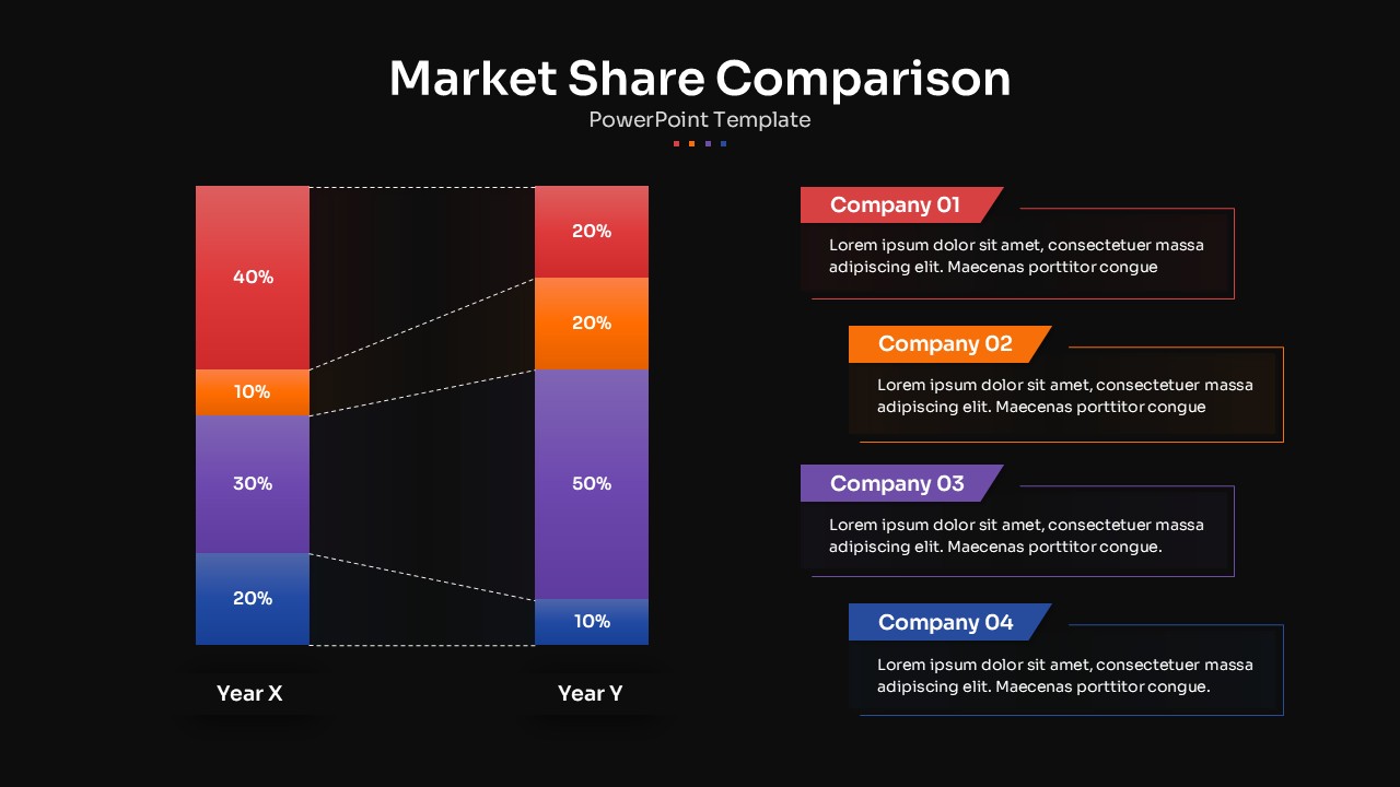
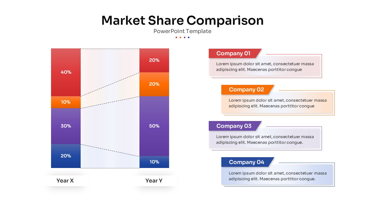
Market Share Competitor Comparison Presentation Slide Black


Description
Use this Market Share Comparison diagram slide to showcase year-over-year shifts in market leadership across four companies. Two stacked bar charts—Year X and Year Y—are color-coded in red, orange, purple, and blue segments, each labeled with percentage values and linked by dashed connectors to highlight gains and losses. On the right, matching callout panels identify Company 01 through Company 04 and provide space for concise insights or strategic commentary. The clean white background, subtle drop shadows, and bold headers ensure your data stands out with professional clarity.
Editable vector shapes, text placeholders, and color fills let you update percentages, swap company names, or adjust hues to align with your brand palette. Master-slide integration guarantees consistent typography and spacing across your deck, while intuitive alignment guides speed up layout adjustments. Duplicate the slide to compare additional time periods or segment categories, or combine it with KPI dashboards and trend charts for a comprehensive analytics presentation.
Who is it for
Product managers, marketing analysts, sales directors, and executive teams seeking a clear, data-driven way to communicate market share dynamics and competitive positioning.
Other Uses
Repurpose this slide for sales territory comparisons, customer segment shifts, budget allocation changes, or any scenario where you need to illustrate percentage-based changes across categories.