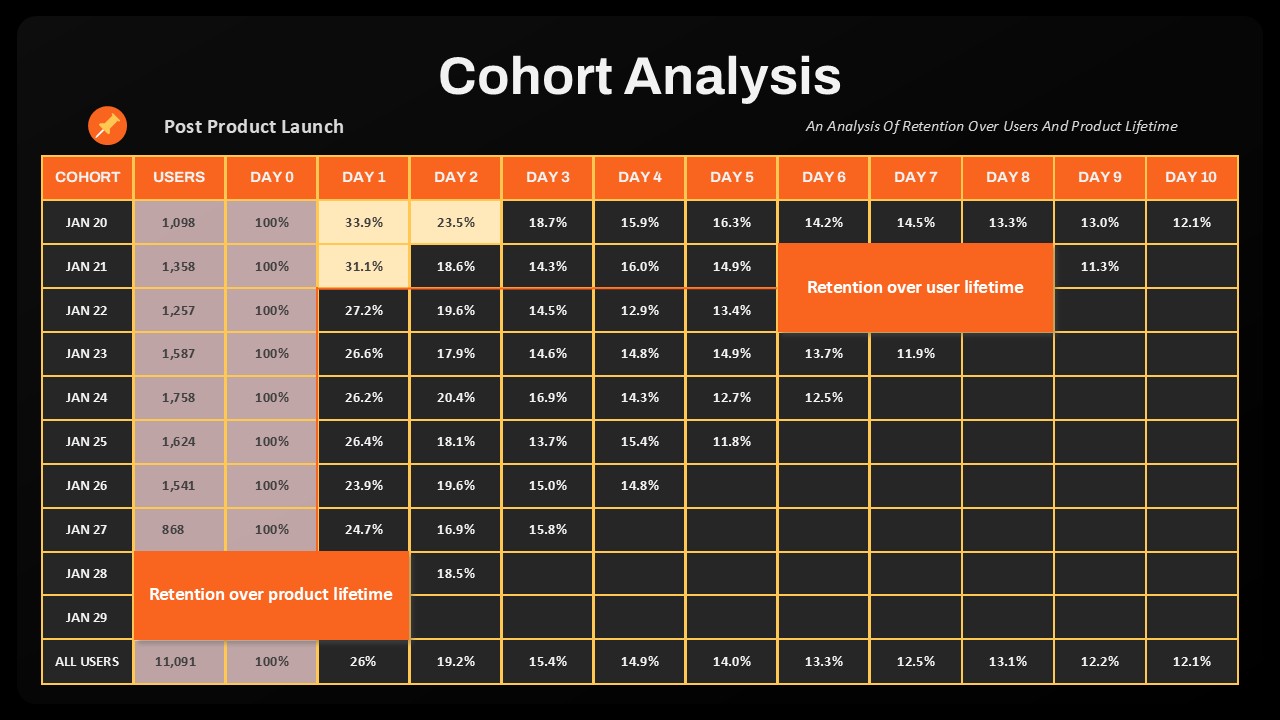
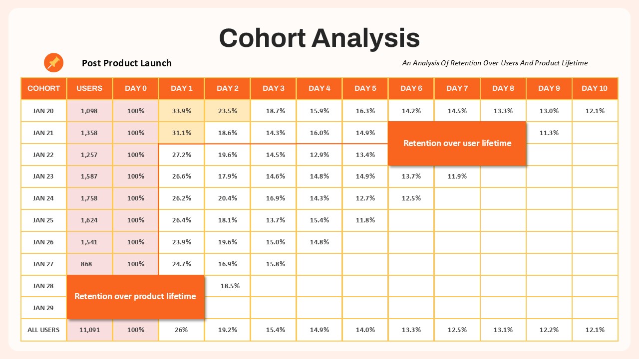
Cohort Analysis Presentation Slide


Description
Turn raw retention data into a clear story with this cohort analysis dashboard. The slide arranges cohorts by start date in rows and time since acquisition in columns (Day 0–Day 10), allowing you to compare how user engagement decays or stabilizes after launch. A bold orange header row, tidy grid, and readable type make scanning effortless, while shaded notes highlight “retention over user lifetime” and “retention over product lifetime.” Everything is fully editable—rename columns to weeks or months, add or remove cohorts, adjust percentage formats, recolor cells to create a heat map, and insert callouts for anomalies or wins. Use the summary row to report overall averages and the user column to weight results. Designed for PowerPoint and Google Slides, the layout preserves alignment when duplicated across a deck and exports crisply for PDFs and stakeholder handouts. Ideal for reviews, this table helps teams diagnose onboarding friction, evaluate growth experiments, and align on actions that lift Day-n retention.
Who is it for
Product managers, growth marketers, and data analysts tracking activation and retention. Founders and PMOs preparing board updates. Customer success teams monitoring cohort health. E-commerce, SaaS, and mobile app teams comparing post-launch performance across campaigns, geographies, or channels.
Other Uses
Repurpose the grid for churn and reactivation analysis, subscription renewal curves, experiment readouts, or lifecycle emails by cohort. Track funnel completion by signup week, compare feature adoption after releases, or segment by plan tiers and device types. Use color scales to spotlight outliers and annotate root causes and next steps.
Login to download this file