Dual Percentage Comparison Metaphor Template for PowerPoint & Google Slides
Dual Percentage Comparison Metaphor Template for PowerPoint & Google Slides
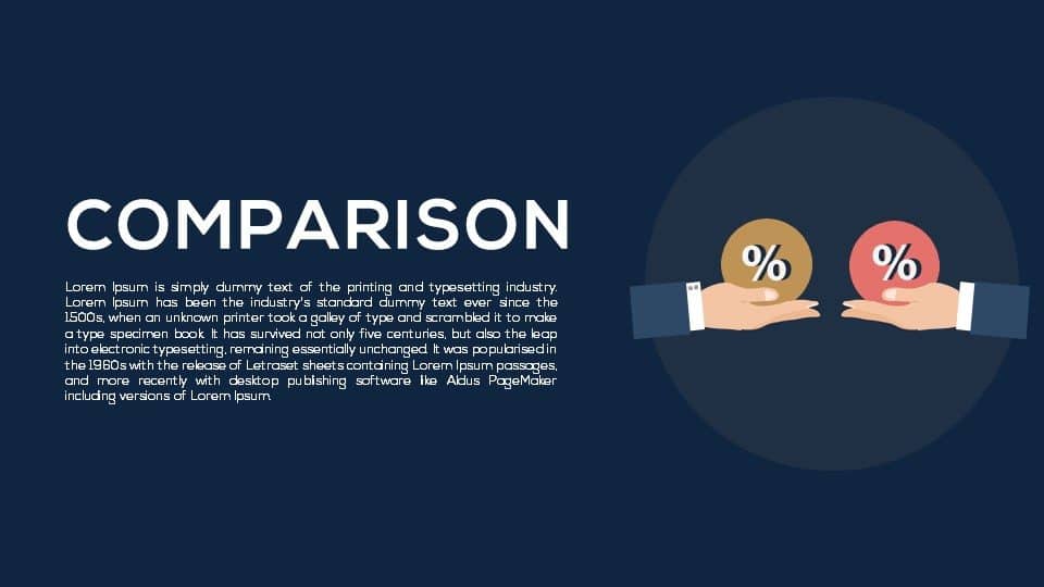
Comparative analysis often falls flat when key metrics are buried inside dense financial spreadsheets. Built around an illustrative metaphor of hands weighing dual percentage tokens, this comparison slide provides executives, financial planners, and market researchers with a direct visual anchor to contrast two competing data points.
The balanced split-screen composition pairs strong narrative context on the left with an intuitive visual comparison on the right. Strategy leads, investment analysts, and product marketers can use this framework to evaluate performance splits, cost-benefit trade-offs, and competitive share metrics without visual noise.
Where This Framework Adds Value
- A/B Testing & Conversion Audits: Contrast conversion rates, retention performance, or engagement deltas between two user flows or campaign variants.
- Budget & Cost-Benefit Trade-Offs: Weigh capital allocation scenarios, vendor pricing differentials, or return on investment projections side by side.
- Market Share & Competitor Benchmarking: Compare company performance metrics against primary market competitors or historical baseline benchmarks.
- Risk vs. Return Assessments: Evaluate relative portfolio weightings, risk exposure ratios, or margin spreads during investment presentations.
Core Strategic Focus Areas
The visual narrative grounds analytical trade-offs in tangible balance and value distribution:
- Direct Side-by-Side Evaluation: Symmetrical gold and coral percentage tokens highlight binary choices, split distributions, or performance variances cleanly.
- Human Weighing Metaphor: Suited hands offering or balancing the metric tokens emphasize executive decision-making, stewardship, and deliberate choice.
- Executive Narrative Anchor: Dedicated paragraph space on the dark left panel gives presenters ample room to document strategic rationale, underlying assumptions, and key takeaways.
Layout Highlights
- Deep navy blue canvas creates an executive, high-contrast atmosphere suitable for formal boardroom settings.
- Left quadrant features bold white typography under the prominent header “COMPARISON” paired with extensive descriptive text space.
- Right quadrant frames the dual percentage illustration within a subdued, dark circular backdrop to keep visual focus centered.
- Warm gold and coral circular tokens add vibrant color contrast while clearly distinguishing Option A from Option B.
- Fully editable vector elements in Microsoft PowerPoint and Google Slides enable rapid adjustments to colors, token text, and slide copy.
Check out more comparison presentation slides like this.
Login to download this file

Item ID
SB00550


Related Templates

Dual-Side Three-Step Ribbon Infographic Template for PowerPoint & Google Slides
Comparison
Dual Topic Mind Map Infographic Template for PowerPoint & Google Slides
Mind Maps
Dual-branch Tree Diagram PowerPoint Presentation Template
Business Strategy
Bottle Data Percentage Infographic Template
Infographics
Percentage Infographics Free
Comparison
Free
Percentage Infographic
Comparison

Read Metaphor Concept Illustration Slide Template for PowerPoint & Google Slides
Infographics
Metaphor Knowledge Illustration Slide Template for PowerPoint & Google Slides
Infographics
Destination Roadmap Pin Metaphor Template for PowerPoint & Google Slides
Roadmap

Metaphor Productivity PowerPoint Template and Google Slides
Graphics
Explore Binoculars Metaphor Slide Template for PowerPoint & Google Slides
Process
Office Workspace Metaphor Slide Template for PowerPoint & Google Slides
Business Proposal
Deadline Metaphor Timeline & Hourglass Template for PowerPoint & Google Slides
Project
Product Shipping Metaphor Diagram Template for PowerPoint & Google Slides
Process
Competition Metaphor Podium Diagram Template for PowerPoint & Google Slides
Business
Process Improvement Metaphor Diagram Template for PowerPoint & Google Slides
Process
Cyber Security Metaphor Diagram Template for PowerPoint & Google Slides
Risk Management
Developer Icons Metaphor Slide Template for PowerPoint & Google Slides
Software Development
Business Growth Metaphor Chart Template for PowerPoint & Google Slides
Business
Teamwork Metaphor Illustration Template for PowerPoint & Google Slides
Leadership