
When to Add Animation to Presentations (And When It Just Looks Gimmicky)

In the world of corporate presentations, animation can be either your greatest ally or your worst enemy. As team leads and managers responsible for presentation development, you’ve likely witnessed both scenarios: the perfectly timed animation that makes data come alive and clarifies complex concepts, and the dizzying barrage of flying text that leaves audiences seasick rather than enlightened.
Animation in presentations represents a powerful tool that, when wielded correctly, can significantly enhance your message’s impact. When used poorly, however, it can undermine your credibility and distract from your core message.
This article will provide clear, evidence-based guidelines on incorporating animation effectively while avoiding the common pitfalls that make presentations appear unprofessional or gimmicky.
The Science Behind Animation in Presentations
Before diving into best practices, let’s understand why animation matters. According to the Nielsen Norman Group, 65% of people prefer presentations with animation. More impressively, research shows animation improves understanding and retention by 43% compared to static slides (source).
Harvard’s Department of Psychology found that animation in presentations makes them feel more dynamic, visually compelling, and professional. Their research demonstrated that animated presentations raised audience perceptions of presenter knowledge, effectiveness, and organization, while helping combat “presentation fatigue” (source).
These findings aren’t surprising when you consider that animated videos lead to viewers retaining 95% of a message compared to just 10% for text-only content, according to Educational Voice (source).
When Animation Enhances Your Presentation
1. To Illustrate Complex Processes or Data Trends
Animation shines when explaining complicated concepts or visualizing data that changes over time. A study from the University of Washington revealed that animated transitions in data graphics significantly reduce error rates and help audiences better track changes (source).
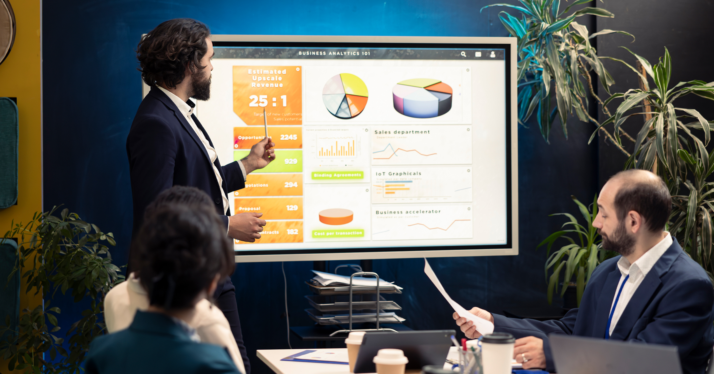
When presenting quarterly sales growth, for instance, an animated line chart that builds progressively helps viewers understand the trend more clearly than a static image showing the entire period at once. The animation creates a narrative and guides the audience through the data step by step.
2. To Control Information Flow and Prevent Overwhelm
Cognitive load theory tells us that human working memory has limited capacity. Animation can help manage this limitation by revealing information gradually rather than all at once.
A comprehensive review of studies from 2016-2024 concluded that animated infographics improve audience interaction, cognitive retention, and information processing more than static ones. Animation enables gradual build-up of visuals and controls information flow, encouraging reflection without overwhelming viewers (source).
3. To Maintain Audience Attention and Combat Fatigue
During lengthy presentations, audience attention inevitably wanes. Strategic animation can serve as a visual “wake-up call” that re-engages viewers.
The Wharton School found that animated content increases viewer engagement by up to 50%, while the Software & Information Industry Association reports that presentations with animation can be 70% more persuasive (source).
4. To Emphasize Key Points and Create Hierarchy
Animation provides a visual hierarchy that helps audiences understand what’s most important. When your key takeaway appears with a subtle zoom or fade effect while supporting points remain static, you’re using motion to direct attention effectively.
When Animation Becomes a Liability
1. When It Distracts From Your Message
Microsoft Research found that while animation makes presentations more exciting, users sometimes find movement confusing, especially with complex, multi-point data visualizations. Their research showed that static visualizations led to fewer errors and clearer analysis in certain contexts (source).
If your audience is trying to decipher bouncing text instead of absorbing your quarterly projections, your animation has become counterproductive.
2. When It Serves No Informational Purpose
Animation should always enhance understanding, not merely entertain. Those spinning 3D pie charts might look impressive, but if the movement doesn’t help clarify the data relationship, it’s just visual noise.
The University of Washington study mentioned earlier distinguished between “gratuitous” animations and those that meaningfully connect to the content. The former diminished comprehension while the latter improved it (source).
3. When Timing Is Off
Poorly timed animations can create awkward pauses, rush through important content, or disrupt the natural flow of your presentation. If your slides are advancing before you’ve finished explaining them, or if animations drag on while you wait for them to complete, you’ve lost control of your narrative.
4. When It Dates Your Presentation
Certain animation styles (like the notorious “fly in” text effect popular in the early 2000s) immediately date your presentation and can make it appear less professional. Animation trends change, and what once looked cutting-edge can quickly become the presentation equivalent of a mullet haircut.
Best Practices for Animation in Presentations
1. Choose the Right Animation Effects
The University of Washington study found that participants responded especially well to staged animations that revealed information progressively, compared to direct, immediate changes (source).
Recommended animation types include:
– Simple fades and dissolves for transitions between slides
– Subtle entrance effects like “appear” or “fade in” for revealing content
– Build animations that reveal bullet points or chart elements sequentially
– Motion paths only when illustrating a specific process or flow
Avoid:
– Bouncing, spinning, or whirling text
– Random motion effects with no connection to content
– Multiple simultaneous animations that compete for attention
2. Perfect Your Timing
Animation timing should feel natural and intuitive:
– Allow sufficient time for viewers to absorb each element
– Coordinate animation with your speaking pace
– Use consistent timing throughout the presentation
– Consider using “click to advance” for complex builds rather than preset timings
3. Use Animation to Support Data Visualization
Microsoft Research emphasizes that animation is effective when the data tells a clean, simple story and movements are synchronized logically (source).
Effective uses include:
– Progressive build of chart elements to highlight changes over time
– Transitioning between different views of the same data set
– Using motion to show relationships between data points
4. Maintain Consistency
Establish a consistent animation language throughout your presentation:
– Use the same entrance effect for similar content types
– Maintain consistent direction and speed for transitions
– Create a recognizable pattern that aids comprehension rather than hindering it
5. Test With Your Target Audience
What works in one context may fail in another. Yale research reports up to a 75% boost in learning effectiveness with animations (source), but this depends on proper implementation and audience fit.
Before finalizing your presentation:
– Preview on the actual display equipment you’ll be using
– Get feedback from individuals similar to your target audience
– Be prepared to adjust or remove animations that don’t resonate
Animation in Presentations: A Decision Framework
To determine whether an animation enhances your presentation or merely serves as a distraction, ask yourself these questions:
1. Purpose: Does this animation clarify information or help tell a story? If not, remove it.
2. Comprehension: Will this animation help my audience better understand the content? The University of Washington research showed that appropriate animations reduced error rates in understanding data (source).
3. Attention: Does this animation direct attention to what matters most? Animation should guide the viewer’s eye, not scatter their focus.
4. Professionalism: Does this animation reflect the professional image I want to project? Harvard’s research shows that well-executed animations can enhance perceptions of presenter competence (source).
5. Technical considerations: Will this animation work seamlessly in the presentation environment? Always test animations on the actual equipment you’ll use.
Conclusion
Animation in presentations is neither inherently good nor bad. It’s a tool whose value depends entirely on how you use it. When implemented thoughtfully, animation enhances comprehension, maintains engagement, and strengthens your message. When overused or poorly executed, it undermines your credibility and distracts from your content.
The research is clear: audiences generally prefer and better retain information from presentations with strategic animation. The key is to ensure that every animated element serves a clear purpose in advancing your narrative or clarifying your data.
By following the evidence-based guidelines outlined above, you can harness the power of animation to create presentations that aren’t just visually engaging but also more effective at communicating your message and achieving your goals.
Related Articles
-
 October 31st, 2025
Add Motion to Presentations That Enhances (Not Distracts From) Your Message
Blog Post -
 October 3rd, 2022
Data Strategy Roadmap Template & Examples
Blog Post -
 June 20th, 2019
Major Components of Company Introduction Slide
Blog Post