
Visual Hierarchy in Presentations: “Hack” Your Audience’s Eyes


As someone who designs presentations, one of the most important skills you can have is mastering the art of visual hierarchy. You should be able design slides that are made to guide your audience’s eyes, which in turn helps you convey your message effectively.
Benefits of visual hierarchy in your PowerPoint presentations.
Designing slides with visual hierarchy helps your slides stand out and captures the audience’s attention. You’ll be able to guide their eyes through your slides, effectively “hacking” their eyes and controlling how they go through the content in your slides. Like I mentioned above, it helps you convey your message effectively, and also helps to engage the audience.
What is visual hierarchy in presentations?
Simply said, visual hierarchy is the arrangement and prioritization of design elements on a slide. This is supposed to guide and lead audience’s eyes along a deliberate path on your slides. Good visual hierarchy can help you keep control over the order in which viewers perceive and process information.
How to achieve visual hierarchy in your PowerPoint presentations?
Focal Point
First things first, you need a focal point. This is a design element that is supposed to capture the audience’s attention. Think of it as an anchor point. This focal point will help draw the eye inwards. There are many different ways you can create a focal point in your presentation design. You can use an image, a title, or use any element that stands out from the rest of your slide. This helps the focal point get attention, serving as the starting point for your audience’s eyes to travel through your slides.
Size and Scale
The size and scale of the elements in your slide play a major role in visual hierarchy. The larger an object is on your slide, the more attention it will attract. You can use this to strategically highlight the important parts of your slide.
You can also use proportional scaling to create a sense of depth and hierarchy in your slides. Placing a larger object, next to a smaller object gives your slide some depth, making it almost feel like the larger object is closer to you than the other object.
Color
Color is a useful tool for establishing visual hierarchy in your presentations. Using bright, saturated colors are great for grabbing attention. Muted colors work best for backgrounds and to let other elements shine. You can also use color contrast to make certain elements in your slide pop, which can guide users intuitively.
Using too many colors is bad for your slides. When you use too many colors, no color stands out, and this ruins your visual hierarchy.
Alignment and Grid
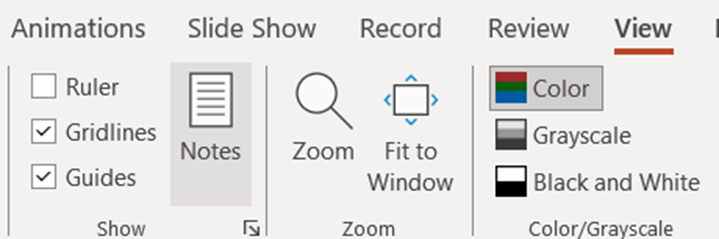
A good design layout in your slide is a must have for effective visual hierarchy. You can switch on the alignment grids features in PowerPoint to get started. To do this, go to View in the ribbon, and check the Gridlines and Guides options.
Your slide will now have useful lines and markers that you can use to finetune the alignment and position of elements in your slide.
Paying attention to alignment in your slide design can create a sense of order and coherence in your slide. You can align related elements to establish relationships. Use grids as guides to create designs that lead your audience’s eyes across the slide.
Typography
Typography is yet another effective tool that you can use to guide your audience’s eyes. Use different font sizes, weights, and styles to highlight key points, and to separate them from subpoints or normal paragraphs.
Visual Contrast
Visual contrast is an important principle when it comes to visual hierarchy. When designing your slides, try creating contrast by using color, size, and shape. Contrast helps your audience distinguish between the different elements present on your slide.
How do you create visual contrast? By having similarities. Without similar elements blending together in your design, there wouldn’t be anything that stands out from them. So avoid having too much variation in your slides, since it prevents you from creating visual contrast, and also can create visual fatigue and confusion.
So there you have it, a quick guide on how you can create visual hierarchy in your PowerPoint presentations. By following the tips mentioned above, and utilizing them the next time you design your presentation, you’ll be able to create slides that are able to guide your audience’s eyes through your content. Good luck on your presentation! Don’t forget to check out SlideBazaar for PowerPoint presentation themes and templates.
Related Articles
-
 January 2nd, 2025
How to Turn PowerPoint Slides into Notes
Blog Post -
 May 7th, 2025
What is the 7×7 Rule in PowerPoint and How to Apply It
Blog Post -
 March 6th, 2023
SMART Goals for Managers – Examples and PPT Templates
Blog Post