How to Create Visually Appealing Slides

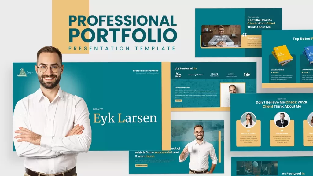
One of the many important aspects of creating an impactful presentation is creating visually appealing slides. No matter whom you are presenting to, visually appealing slides can help engage your audience. It also helps convey your message more effectively.
This article has tips and best practices for creating visually appealing slides. Learn how to use high-quality images, fonts, and colors to create beautiful, uncluttered slides. Follow the steps mentioned here to create professional, stunning slides to help you deliver an impactful presentation.
There are several ways you can make visually appealing slides. Let’s start with the very basics:
Use high-quality images

Use high-resolution, professional-looking images that are relevant to your content. Avoid blurry or pixelated images, as they can distract your message.
High-quality images can help to illustrate and clarify your message, as they provide a visual representation of the concepts you are discussing. This can make it easier for your audience to understand and retain the information you are presenting.
Using high-quality images can also enhance your credibility as a presenter, as it shows that you have put effort and care into your presentation. This can help to build trust and establish you as an expert in your field.
Research has shown that people are more likely to remember information that is presented visually, as opposed to just through text or spoken word. By using high-quality images, you can increase the likelihood that your audience will remember the key points of your presentation.
Use appropriate fonts

Use fonts that are easy to read and appropriate for the tone and style of your presentation. Avoid using too many different fonts, as it can make your slides look cluttered and confusing.
How do you choose appropriate fonts for your presentations?
Different fonts can convey different moods and personalities, so consider the preferences and expectations of your audience.
For example, a formal business presentation might be more suited to a classic serif font, while a creative presentation might benefit from a more playful sans-serif font.
Make sure to use appropriate font sizes for your audience and presentation setting. For example, you may want to use larger font sizes for presentations to larger audiences or for slides that will be viewed from a distance.
Pro tip: It’s always a good idea to test your font choices by presenting them to a small group or practicing your presentation in front of a mirror. This can help you see how the fonts look and ensure that they are easy to read.
It’s generally a good idea to stick with simple, easy-to-read fonts that won’t distract from your message. Avoid using too many different fonts or overly decorative fonts that may be hard to read.
Use color effectively to highlight important points and add visual interest to your slides. Avoid using too many different colors, as it can be overwhelming to the viewer.
Use appropriate slide layout.
Use a slide layout that is appropriate for the content you are presenting.
A well-organized slide layout can help improve your message’s clarity, as it guides the viewer’s eye and helps them understand the relationships between different pieces of information.
Use appropriate slide transitions.
Use slide transitions that are appropriate for the tone and style of your presentation. Avoid using transitions that are too flashy or distracting.
Good transitions can help improve your presentation’s flow, allowing you to move smoothly between different topics and ideas. This can make your presentation feel more cohesive and easier to follow. Using transitions can also give you greater flexibility in how you structure your presentation, as you can easily move between different sections or skip over unnecessary or extraneous information.
Use appropriate slide animation.
Use slide animation to highlight important points or add visual interest to your slides. Avoid using too much animation, as it can distract the viewer.
Animations can give you greater control over your presentation’s pace and the way that information is revealed to your audience. This can allow you to tailor your presentation to your audience and adjust the pacing to suit the needs of your presentation.
Animations can also be used to make your presentation more accessible for viewers with visual impairments or other disabilities. By using animations to highlight important information or provide additional context, you can make your presentation more accessible to a wider audience.
Keep it simple.
Avoid overcrowding your slides with too much information or too many elements. Keep your slides clean and uncluttered, and focus on presenting one main idea per slide.
Simple slides can often impact your audience more, as they allow you to focus on a few key points and avoid diluting your message with too much information.
Simple slides can also be easier to read, using clear and legible text and avoiding overcrowding the slide with too many elements. This can make your presentation more accessible and easier to follow for your audience.
Conclusion
In conclusion, creating visually appealing slides is an important aspect of creating a successful presentation. By following the tips discussed in this article, such as using high-quality images, appropriate fonts, and color, and keeping your slides clean and uncluttered, you can create professional, visually appealing slides that will help engage your audience and effectively convey your message. With a little bit of effort and attention to detail, you can create visually appealing slides that will help you deliver a powerful and effective presentations.


