How to Create Presentations for Everyone – Presentation Inclusivity

For your presentations to be truly effective, they need to be accessible to everyone. And by everyone, I mean a diverse audience, including people with disabilities. In this article, we’ll take a look at some strategies you can implement easily to create presentations that are inclusive. Here’s presentation inclusivity 101. Oh, and if you think we’re missing out on any detail, do let us know what you’d like us to add.
Why is Presentation Inclusivity Important?
Here’s why presentation inclusivity is important:
With an inclusive presentation you can ensure that everyone in the audience can understand your presentation. This even includes people with visual or hearing impairments and other disabilities. By using features that are already built-into PowerPoint, and by making some changes to your content, you can make sure that everyone can follow your presentation.
It also helps with engagement. When people feel like a presentation is designed for them, they’re more likely to be engaged and interested in it. Make your presentation more relatable to a wider audience, and you stand to gain from a more engaged and active audience.
An inclusive presentation also shows that you’ve put a lot of thought and research into your audience and their needs. This conveys a sense of professionalism, which can improve the credibility of the message you’re trying to convey.
There are so many more reasons why an inclusive presentation is better, but let’s just get to the important part. Let’s dive right into exploring how you can actually make your presentations more inclusive.
How to Create Accessible Slides
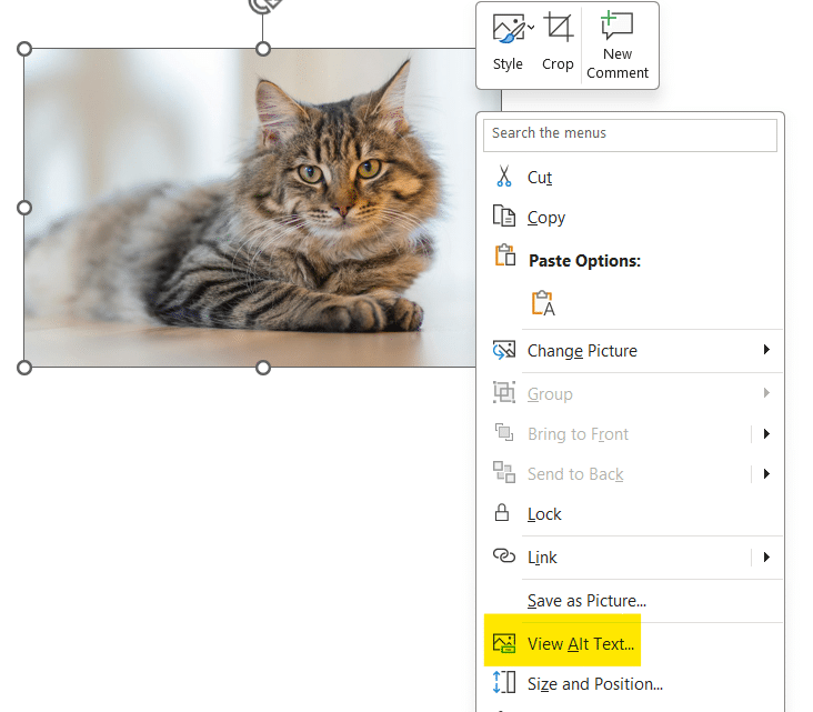
You should always design slides with accessibility in mind. This can be practices such as using high-contrast color schemes, especially colors of your background and text. Oh and speaking of text, make sure you use easy-to-read fonts. Another thing you can do, in PowerPoint, is adding alternative text or text descriptions for your images.
To do this, right click the image and select View Alt Text.

Sometimes a message will appear below the image right when you insert it. The alt text will be automatically generated, but in case you want to change it, click on Edit.

Also consider adding text descriptions to your charts and graphs as well, explaining the information that they convey.
If you’ve got handouts or physical copies that you need to distribute, follow the same principles. Use large fonts, with simple and clear layouts. You can also consider using digital formats that are compatible with screen readers.
How to Deliver a Presentation Inclusively:
First things first, ensure that everyone can see and hear you clearly. If your presentation is virtual, you can use features like closed captions to improve accessibility. Just make sure to mention that closed captions are available, and maybe even remind your audience how to active them. More on this later on in the article.
Next, introduce yourself with your pronouns, and also add a brief physical description, but no need to go overboard. This can be useful for attendees who may be visually impaired. You should also narrate the content of images, charts and graphs, instead of just showing your slides.
Make sure you use gender-neutral language when addressing your audience. Use terms like everyone, audience, participants instead of gendered terms like ladies and gentlemen.
What should you consider when it comes to your audience?
When presenting, and especially when asking questions, allow enough time for responses. You should factor in potential delays caused by audio, or by assistive technologies like screen readers. If there’s a microphone, always use it. Even if you’re in a small space, a microphone can help your voice me more audible.
Using Simple Language in Your Presentations
It is always advisable to use simple and plain language in your presentations. Writing in plain language is all about simplifying sentences, avoiding technical jargon, acronyms, and complex words in your presentations. Your text should convey the message clearly and concisely in the simplest way possible. It does not matter who you are presenting to, using simple language is always recommended. This specifically helps people with have trouble focusing, or dyslexic people, and even people whose primary language isn’t English.
It’s important that you identify the audience that you’re addressing and choosing language that suits them. Using simple language does not mean dumbing things down, its all about communicating what you want, concisely. You can use online tools like the Hemingway Editor to reduce the reading age of your text. Also, this doesn’t only apply to the text in your slides, make sure the language you use while presenting is simple as well.
Using Inclusive Language in Your Presentations
Make a conscious effort to avoid words that could be discriminatory to people based on ability, socioeconomic status or even gender. One way to do this would be to use gender-neutral words like ‘they’, ‘them’, when you don’t know a person’s gender. There are many other gender-neutral words that you can. Here are some common examples:
| Gendered Term | Gender-neutral Term |
| businessman, businesswoman | business person |
| waiter, waitress | server, or table attendant |
| manned | crew |
| man, woman | person |
| mankind | humankind |
| man-made | synthetic or machine-made |
| clergyman, clergywoman | cleric, minister |
| coed | student |
| delivery boy | delivery person, courier |
Make sure you also describe the visuals on your slides in such a way that all the necessary information is conveyed to someone who cannot see them. You don’t have to do this for everything, just the visuals that matter. When talking about your charts, be mindful when describing the colors on the charts, as this may be confusing for those with color blindness and similar conditions.
Use Accessibility Tools in PowerPoint
You can use features in PowerPoint to produce automatic captions when you deliver your presentation. If you’re delivering your presentation online, you can set up captions on transcriptions in your meeting settings. Apps like Teams have this feature in-built, giving you the choice to even select more than 50 different languages!
Speaking of Teams, if you’re presenting on a Teams meeting, instead of sharing your screen, launching PowerPoint and presenting, simply use PowerPoint Live. This is found under the share button in the Teams meeting. Using this feature lets you use meeting tools that can help your presentations be more inclusive. The best part is that it allows the members of your meeting to interact with your presentation how they want. They will be able to use screen readers, use the translation features, and so much more. Users can navigate your slides however they want, independently. Try it out the next time you have to deliver a presentation via Teams.
Other tips for making your presentations more inclusive:
If you have planned a QnA session, try to conduct it in such a way that audience members can send in questions digitally, like a chat or an anonymous form. Having less content, makes it easier for people to pay attention, so cover key points, and simplify your content. If you have a lot of information to convey, try using handouts or something similar, like a digital copy of the presentation.
Lastly, avoid flashing imagery in your presentations, as it may trigger seizures in some people.
I hope you’ve found this article on creating and delivering inclusive presentations helpful. I’ll be updating this article with more useful information, so feel free to bookmark this page and check again later.


