
How to Create a Poster Presentation
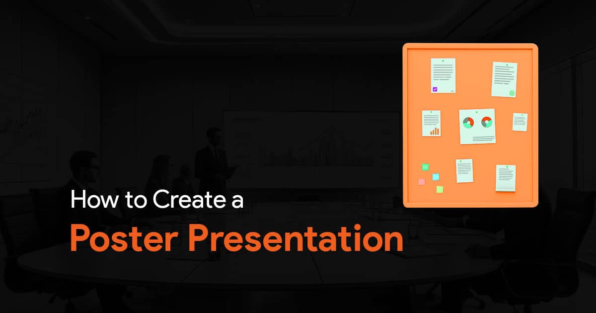

Creating an effective poster presentation is a crucial skill. A well-designed poster can convey your research, ideas and project findings in an engaging and visually appealing format. In this guide, you will know all about the essential steps of creating a poster presentation. Everything from planning your content layout to knowing how to design your poster to ensure clarity and readability. Whether you’re preparing for a conference, an academic presentation or a public display, these tips and techniques will help you craft a compelling poster that captures attention and communicates your message effectively.
Tips on Presenting a Poster
Pay attention to how you stand.
Do not cover the poster, always stand beside it so that people can easily view your poster. Make sure to stand at your poster for the entirety of the poster session. If you do need to take breaks in between, or if your poster will be on display when you’re not around it, make sure to leave some contact details on the poster. This is to ensure that you can be contacted by viewers who may read your poster while you are not there.
Smile and be enthusiastic!
Have a smile on your face! You should appear friendly if you want people to approach your poster with questions or doubts. Also, be enthusiastic, even towards the end of your session. If you want others to find your work interesting, you should too! Take a genuine interest in their curiosity, and show enthusiasm when answering questions or doubts. While presenting, point to relevant parts of the poster so that the audience can follow along to what you say. Another thing you must do is maintain eye contact. Look at your audience while presenting as it keeps them engaged and involved.
Elevator pitches are a must!
You should have 2 elevator pitches ready for your audience. One that is a minute long, and another that is 2 minutes long. Talk about the topic, what you have found and why it is important.
Here is a sample of an elevator pitch that you can modify:
I’m exploring [RESEARCH QUESTION]. To answer that, I looked at [ ]. My hypothesis is [ ]. For me, the most interesting finding we got is [ ]. It indicates that [ ].
(Keep in mind this is just a bare bones example, I am sure you can come up with an elevator pitch on your own like this!)
Tell a story.
To keep your audience engaged, use storytelling techniques while presenting your poster. Your presentation should have a beginning, a middle and an end.
Start by talking about any background information they should know, and how you started your research. Then move on to how you got the conclusion, why you did the things you did, and what you found along the way. End with your conclusions, consequences, and any other notes you may have. Having a clear structure to your presentation like this can drastically improve your presentation!
Know your audience.
If you’re just going to have a general audience with varying levels of knowledge about your topic, you might need to adjust the degree of details in your presentation. Avoid complicated jargon, and keep your content. However, if your audience has people who are knowledgeable, then you may not need to do this. So, before working on the content, make sure you know your audience.
Ask a peer!
Always get your poster presentation reviewed by peer. Having another set of eyes looking at your poster is going to be helpful as they might notice mistakes or areas of improvement in your poster.
Less text, more everything else.
It’s always best to have less text and words in your posters. Instead try to fill your poster with more schemes, pictures and graphs. There’s no point in adding too much text, when you’re already standing right next to it to talk about your work. The only exception to this is the scenario where you are not going to be physically around your poster. In such a case, yes you can add more text to your slides, but still keep a limit. Nobody wants to read a wall of text.
Number your sections.
Make sure you number the sections on your poster. This makes it so much more easier for your audience to understand the flow of content. This makes them stick around for longer, and they’re more likely to read through your poster.
How to Make a Good Poster Presentation
You can use the tools you already have to make a good poster presentation. And by that I mean PowerPoint! PowerPoint is the best tool you can use to create poster. Here are some tips to keep in mind while creating your poster presentation.
Slide Setup
Your poster should be created on a single slide. There are a few things that you should note before you start designing your poster. When you’re done, you can print the slide right away from PowerPoint.
Check Dimensions
Always check dimensions of your poster first, before you start working on it. Once you figure out the dimensions, you can easily change the dimensions of the PowerPoint slide you’re working on:
- Select the Design tab in the ribbon.
- Select Slide Size.
- Select an aspect ratio or set up a Custom Slide Size.
Focus on Readability
All information you add on your poster must be readable from about 10 feet away. So make sure your font size is big enough, and that there’s enough contrast between the background and the text. Make readability your top priority. Make sure you show your data and numbers clearly, and not too small.
Poster Templates
There are plenty of templates online that you can use to create your poster presentation. You can find many on SlideBazaar.com. Check out a few examples below:
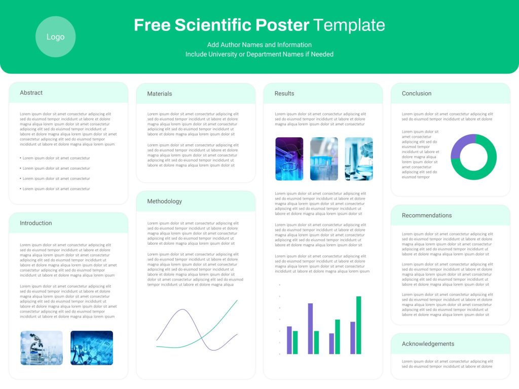
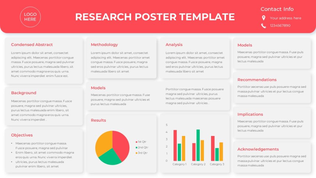
Plenty of other templates like this available on our website. Feel free to check it out!
Slide Design Tips
Your poster should read from top left to bottom right. Like I mentioned above, maintain a good contrast between the background color and the text. Use a light color background and a dark text. Avoid using gradient color fill background, especially black. The title should be almost cover the entire width of the poster with the main text broken into columns.
For font choices, sans-serif fonts work best. Make sure you adjust the font size depending on the font and the amount of text on your poster. For maintaining visual consistency, keep the headers the same size, and use the same font size for the entire the poster for all body text.
Here is an example of font size you can follow. For titles, try 72-120 pts. Subtitles can be smaller, 48-80 pts. Section headers can be 36-72 pts. And keep your body text between 24-48 pts.
If you need to save your poster as a PDF, you can easily do that by going to File > Export and click on Create a PDF document.
Well, that’s about it. I’ve covered some tips and guidelines that you must follow the next time you create poster presentations. Make sure you follow the above tips well, and your poster presentation will go smooth. If you need PowerPoint templates for poster presentations, check out SlideBazaar.com!
Related Articles
-
 July 5th, 2024
Fonts Combinations You Must Try in Your Next PowerPoint Presentation
Blog Post -
 February 8th, 2024
Best Resources for Images for Your PowerPoint Presentations
Blog Post -
 January 21st, 2025
The Ultimate Guide to Mastering OKRs for Business Success
Blog Post