
Fonts Combinations You Must Try in Your Next PowerPoint Presentation

You don’t realise this, but there’s a secret weapon lurking right there in PowerPoint that can turn your presentations from a snoozefest to something that’s visually impressive. From band to brilliant. That weapon, is typography. Fonts.
Choosing the right fonts can really elevate your slide design and make your presentation look much more classy and polished. It might feel like a small thing, but the effect it has on your presentations is massive. But just simply choosing a font and using it everywhere isn’t enough. Some fonts work great in pairs, and some don’t. There’s also a visual hierarchy that you must follow, which means you’ll have to assign different types of fonts, to different sections of text in your slides.
In this article, I’m going to suggest a few font pairings, that you can try out in your next presentation. I will be updating this page with more fonts, so be sure to bookmark this page, and check again later to be updated. So without further waiting, here are some fonts that you should use in your next PowerPoint presentation.
Montserrat and Merriweather
Montserrat is a great font choice to use for titles in your slides. It is a very common, but underrated font that works great in presentations, giving your slides a clean, professional look.
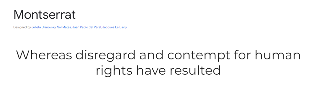
Merriweather is a font that goes well with Montserrat, you can use it for body content in your slides. This is another common but underrated font, that gives your slides a very clean professional look.
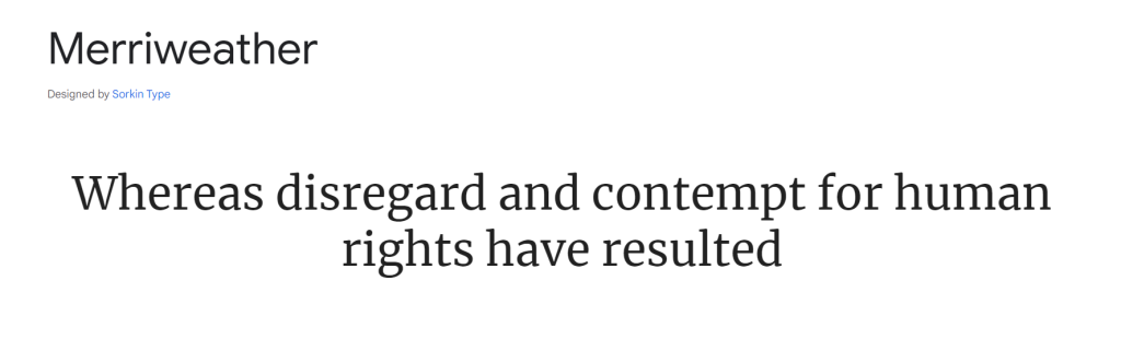
Both these fonts are great for professional presentations, and with the right color contrast, they are extremely readable, even to audience members at the back. Feel free to download both fonts, and try them out in your presentation today!
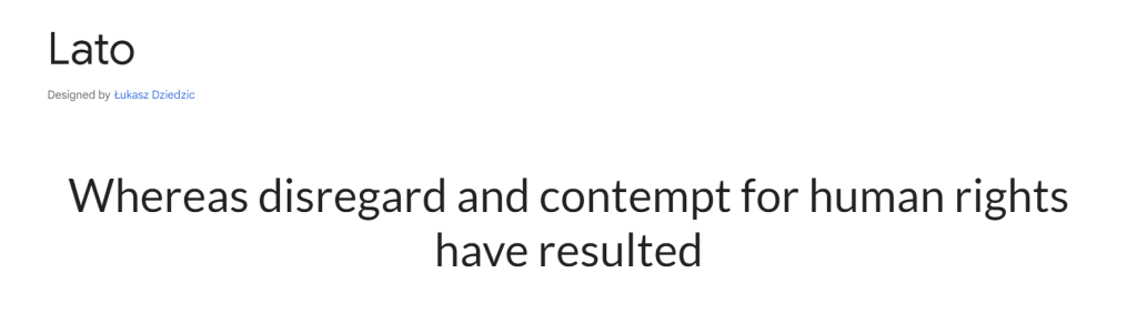
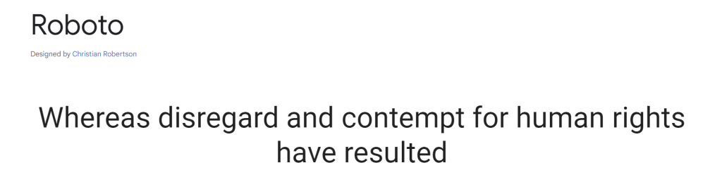
Lato and Roboto.
Lato and Roboto are 2 similar fonts that work well together on your PowerPoint slides. Use one for titles, main points, and headings, while the other can be used for paragraphs and body content. These fonts are super clean, and can be used in professional and even in presentations that are a little bit more casual. Readability is high with these fonts, and it’s hard to go wrong with them. Just stick to these 2 fonts in your entire presentation and your slides will look amazing.
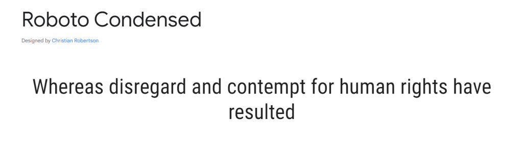
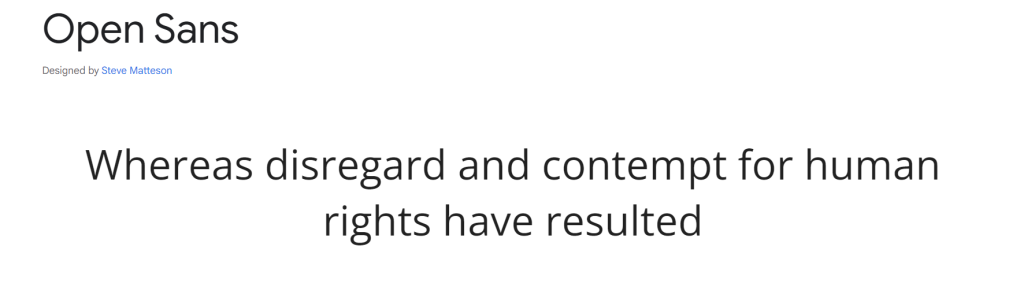
Roboto Condensed and Open Sans
One of my favorite font pairings, these two fonts work well together. They are great for presentations for school, colleges, and even for some professional scenarios. Roboto Condensed is great for titles, while Open Sans can be used for paragraph text. Check out these fonts from the links below (click the images) and try them out in your presentation today!
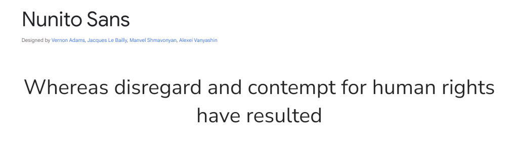
Nunito Sans Bold and Nunito Sans regular
This is a great font that you can use in your next PowerPoint presentation. Use Nuno Sans Bold for your titles and headings, and the regular version for all your body text and paragraph. This is yet another font that looks professional and can be used for more relaxed presentations as well. Check it out today!
Work Sans and Merriweather.
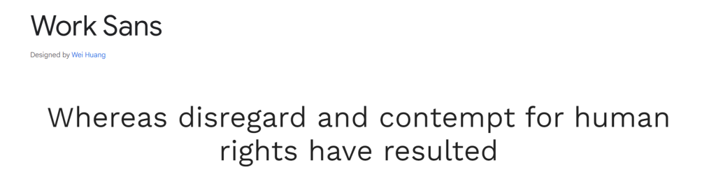
This font combination is great for corporate style presentations, and other professional presentations. Great for modern looking presentations, with a touch of class. Use this fonts if you’re looking for a classy-professional feel to your presentations.
Conclusion
So, say goodbye to boring Arial and hello to a world of typographic possibilities! Remember, the fonts you choose are like your presentation’s outfit – they tell a story about your brand and message. So, take some time to pick fonts suit your presentation, and make sure you get it right, since it can really change how your presentations look!
Related Articles
-
 April 17th, 2024
Easy PowerPoint Animations for Your Next Presentation
Blog Post -
 October 9th, 2020
Cost Benefit Analysis
Blog Post -
 September 16th, 2025
Train Your Team on These PowerPoint Shortcuts and Save 2 Hours Per Deck
Blog Post