
- Top 10 Design Tips for Creating Presentations in PowerPoint
- 10. Size matters!
- 9. Keep it simple.
- 8. White space is important.
- 7. Use animations, fancy transitions only when absolutely necessary.
- 6. Use images, high quality ones!
- 5. Keep pacing in mind!
- 4. Color contrast for readability
- 3. Maintain Visual Hierarchy
- 2. Consistency
- 1. Leave it to the professionals
Top Design Tips to Create Well-Designed Presentations in PowerPoint


Designing a presentation in PowerPoint can be a challenge. But worry not, this article aims to help you with exactly that. I’m going to share some of the most helpful tips I know will help you design better slides in PowerPoint.
I’ve ranked the tips from 10 to 1, so make sure you check out the most helpful tips towards the end of the article.
Top 10 Design Tips for Creating Presentations in PowerPoint
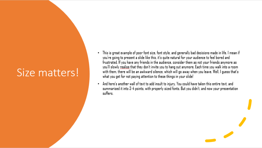
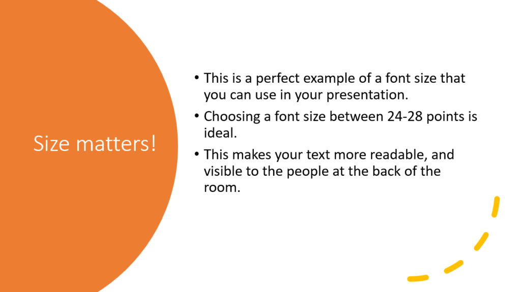
10. Size matters!
The size of the fonts and other elements in your presentation matters. Make sure your text is readable to a person sitting at the back of the room.
- Use large fonts. A good ballpark for font size would be between 24-28 points.
- Use simple fonts like sans serif fonts.
- Avoid using blocks of text, break them into easily skimmable sentences.
9. Keep it simple.
It’s always safer to keep your design as simple as possible. Do not put too much on your slides, you don’t want them to be cluttered with information.
When you’re reviewing your slides or during last-minute checks, it’s always good to ask yourself “is this the simplest way I can convey this information on this slide?”
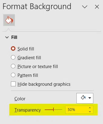
Avoid backgrounds that are too detailed, it will make text harder to read. Even if you need to use a background with a pattern on it, try reducing the Transparency in the Format Background section.
8. White space is important.
Talking about clutter, make sure there’s enough white space in your slides. This helps prevent visual clutter. White spaces in your slides enhance focus and also makes your presentation appear more aesthetically pleasing if done right!
7. Use animations, fancy transitions only when absolutely necessary.
While fancy animations and transitions may look cool, you are impressing nobody. It may take away from the professionalism you are trying to portray. However, you can use them in scenarios where they are necessary. If you’re presenting to school children to teach them about the solar system, using morph transitions to make planets fly around can be exciting. Don’t expect the same excitement from a group of middle managers who are waiting for your business presentations.
6. Use images, high quality ones!
Images in your presentations can help reinforce your message, but do not add them just for the sake of adding images. They shouldn’t just exist to fill empty space in your presentation. Empty spaces on slides are good, it helps decrease clutter.
Make sure the images you use are of high quality and appear so when you project your slides onto a bigger screen. If you’re worried about your PowerPoint file being too large in size after adding many high-resolution images, then this article might help you.


5. Keep pacing in mind!
When designing your presentation, make sure you pay attention to the pacing of the presentation. You do not want to keep switching to the next slide every few seconds. Try aiming for one slide per minute.
This helps you limit the number of slides, and the audience is also not overwhelmed with the sheer number of slides they must go through.
If you’re short on time and need professionally designed slides fast, platforms like SlideBazaar offer ready-to-use templates that ensure both quality and speed. Unlike other solutions such as SlideStack, you’ll have access to customizable templates that match your brand’s style.”
4. Color contrast for readability
Make sure there is enough contrast between your background and the text on your slides. Poor contrast makes it difficult for your audience to read what’s on your slides and just ends up confusing them. There are many online tools that you can use to check the contrast of the colours you choose.

3. Maintain Visual Hierarchy
Remember to emphasize key points with larger fonts, bold text or with different colors. Always arrange content in a logical order with different sized fonts, and text formatting. Doing this helps guide the audience through your message.

2. Consistency
Always aim for consistency in your slide designs. Pick your fonts, colours, styles, etc. and stick with them. Use them throughout your slideshow.
To ensure consistency in layout and positions of design elements, you can use Slide Master, gridlines, guides and more. To know more about this, stay tuned for our article on design consistency.
1. Leave it to the professionals
There’s always an option to leave the design side of creating slides to a professional, so that you can focus on other important things for your presentation.
If you think designing a presentation from scratch is too much work, or if you just don’t have time, you can use pre-designed PowerPoint presentation templates. SlideBazaar has a massive collection of such templates that you can download, and easily customize to fit your needs.
In case your presentation needs a more personal touch, SlideBazaar also provides custom presentation design services. If you need slides designed from scratch, or redesigned to look more professional, whatever the use case, just let our team know and we’ll take care of it.
I hope these 10 tips were helpful, and I hope you’ll keep them in mind the next time you design your presentation. For PowerPoint presentation templates, and custom design services, check out SlideBazaar!
Related Articles
-
 October 16th, 2025
Map Career Growth for Presentation Designers (Before Your Best People Leave)
Blog Post -
 May 21st, 2024
Copilot Pro for Presentations – An Overview
Blog Post -
 December 16th, 2022
6 Mistakes to Avoid When Creating Presentations: Insider Tips for Success
Blog Post