


Risk Management Heat Map Templates for PowerPoint And Keynote
Description
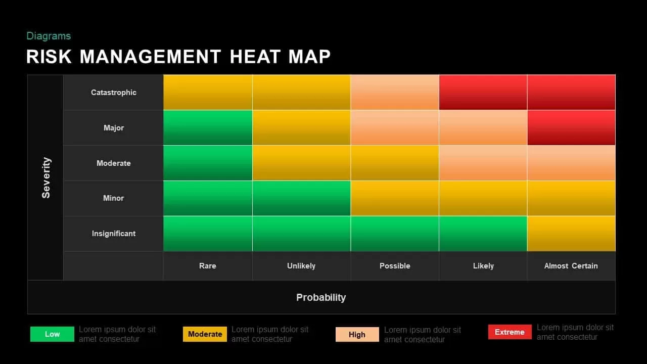
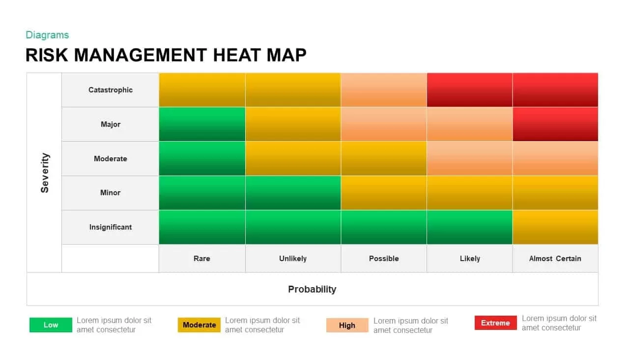
Use this Risk Management Heat Map diagram to assess and visualize potential threats by mapping severity and probability along two axes. The 5×5 grid assigns each cell a color-coded tier—green for low risk, yellow for moderate, orange for high, and red for extreme—allowing stakeholders to instantly identify priority areas. Axis labels for Severity (Insignificant to Catastrophic) and Probability (Rare to Almost Certain) are placed along the left and bottom edges, with a clear legend at the bottom to define risk levels. The clean white background and crisp typography ensure readability in boardroom presentations or digital reports.
Designed with fully editable shapes and vector art, this template uses master slide layouts and placeholder text for effortless customization. You can adjust cell colors, modify axis labels, and update legend descriptions to fit your organization’s risk criteria. Swap the default green–yellow–orange–red palette for custom brand colors, or resize the grid to reflect different risk matrices. The flat design and uniform cell dimensions maintain consistency across slides, while drag-and-drop elements enable quick rearrangement and layering of content.
Ideal for risk assessments, compliance reviews, and strategic planning sessions, this asset streamlines communication of complex data through a widely recognized matrix format. Embed performance charts or KPI dashboards alongside each risk tier to correlate incident trends with control measures. Compare risk profiles across departments by duplicating and reordering charts, or animate transitions between matrices to highlight changes over time. With full compatibility across PowerPoint and Google Slides, the slide preserves formatting, vector quality, and layout integrity on any device. Leverage this Risk Management Heat Map diagram to drive informed decision-making and prioritize mitigation efforts effectively.
Who is it for
Risk managers, compliance officers, and project leaders can leverage this heat map to prioritize risk mitigation and align stakeholders. Auditors, safety engineers, and business continuity planners also benefit when illustrating threat landscapes and control strategies in executive reports or training sessions.
Other Uses
Apart from risk assessments, repurpose this matrix to visualize issue severity versus frequency in quality control, map customer satisfaction against engagement scores, or illustrate financial exposure by scenario. Duplicate and customize the grid to compare project status heat maps, sales performance matrices, or operational KPI thresholds.
Login to download this file

Item ID
SB00973