


Dos and Don’ts PowerPoint and Keynote template
Description
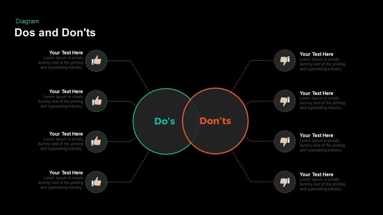
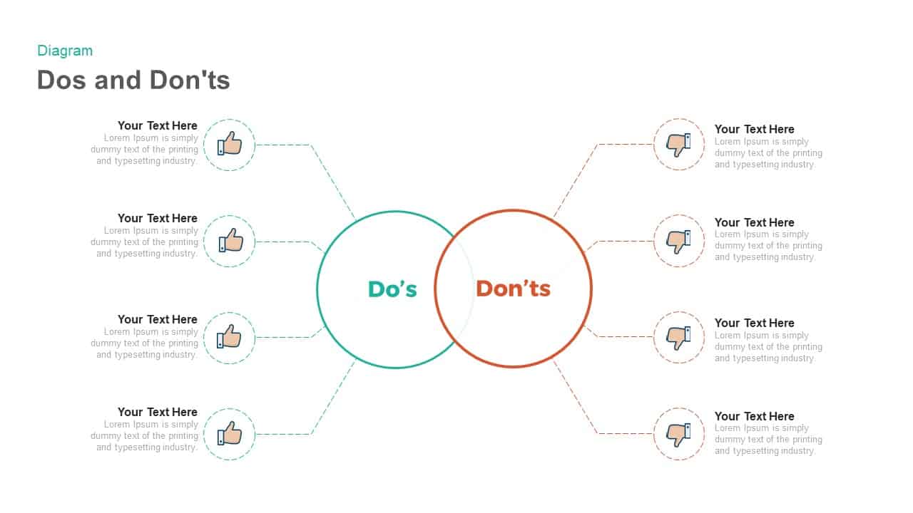
Organize best practices and pitfalls with this split-circle Do’s & Don’ts diagram slide, featuring two adjacent rings—emerald green for recommended actions and coral orange for discouraged behaviors—connected by dashed guide lines to multiple text nodes. Each side supports up to four customizable entries paired with intuitive thumbs-up or thumbs-down icons, enabling clear differentiation between positive guidelines and common mistakes. A minimalist white background and subtle gray typography ensure maximum readability, while the overlapping circle layout provides a balanced, symmetrical frame for your content.
Built on fully editable vector shapes and master slides, this asset streamlines customization in both PowerPoint and Google Slides. Swap text placeholders, adjust icon styles, or switch color accents in seconds to match your brand palette. The dashed connector lines and crisp circle outlines can be recolored or resized without quality loss. Use entrance animations to sequentially reveal each Do or Don’t item, reinforcing audience engagement and guiding attention through your narrative.
Ideal for policy reviews, style guides, safety trainings, and stakeholder briefings, this Do’s & Don’ts framework clarifies complex instructions and aligns teams on best practices and risk areas. Trainers, compliance officers, and HR professionals can leverage the slide in workshops, webinars, or printed handouts, while marketers and product managers can apply the structure to showcase feature pros and cons. The scalable vector design also supports high-resolution exports for large-format displays or PDF documentation.
Combine this diagram with complementary process or comparison layouts to create a cohesive deck. By leveraging its straightforward yet impactful design, you can drive clarity, reinforce key messages, and ensure consistent communication across presentations.
Who is it for
Business leaders, HR managers, and compliance officers will find this diagram invaluable for policy enforcement, training sessions, and style-guide presentations. Marketing teams, product managers, and project coordinators can use it to contrast feature benefits and potential pitfalls. Trainers, consultants, and educators can also employ the layout to illustrate do’s vs. don’ts in any instructional setting.
Other Uses
Beyond guideline comparisons, repurpose this slide for before-and-after scenarios, risk vs. reward analyses, or quality-control checklists. Adapt the icons and text modules to map customer journey wins and losses, feature roll-out successes and setbacks, or safety protocol approvals and violations.
Login to download this file
Add to favorites
Add to collection

Item ID
SB00917