


Data Driven Line Chart Powerpoint and Keynote template
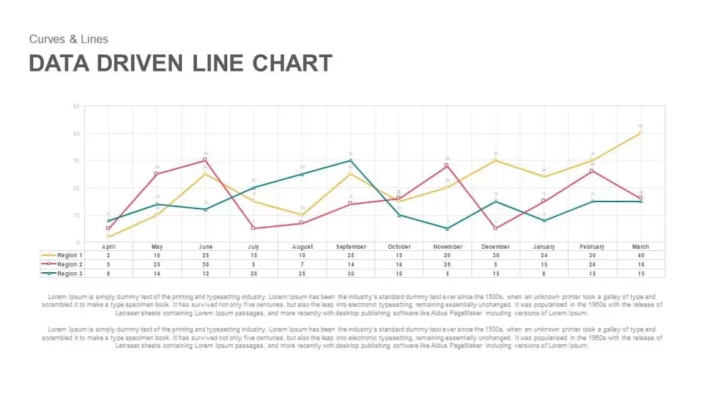
Empower your presentations with this data-driven line chart template, designed to illustrate multi-region trends over a 12-month period. The slide features a three-series line graph on a neutral grid background with precise axis ticks, circular markers, and a linked data table below that aligns visual curves with exact values for Region 1, Region 2, and Region 3. Color-coded series—yellow, red, and green—enhance clarity, while subtle gridlines and clean typography ensure that data remains the focal point. Fully vector-based, the chart maintains crisp resolution at any size, and placeholder layouts simplify slide duplication and repositioning.
This template is fully editable in both PowerPoint and Google Slides. Update table numbers directly or connect to external data sources such as Excel or Google Sheets for real-time collaboration. Customize line weights, marker shapes, axis labels, and gridline density to match your corporate branding or thematic requirements. Use built-in callouts or annotation tools to highlight peaks, dips, or forecasted values. The minimalist design and high-contrast palette accommodate accessibility standards and support presentations on video calls, in auditoriums, and on mobile devices.
Optimize the layout by resizing or relocating the data table and legend to fit your narrative flow. Incorporate trendlines, error bars, or conditional formatting for advanced analytical insights. Grouped and named elements enable seamless teamwork, allowing multiple users to edit charts simultaneously without compromising consistency across your deck.
Who is it for
Business analysts, financial planners, and marketing managers seeking a clear, professional way to compare regional performance or operational metrics will benefit from this slide. Data-driven teams and executive briefings can use the template to support strategic decision-making.
Other Uses
Beyond regional sales or traffic analysis, repurpose this slide to track budget variances, monitor project milestones, present survey results, or display comparative KPI dashboards. Simply adjust series labels and table values to fit any time-series data story.
Login to download this file
Add to favorites
Add to collection

Item ID
SB00848