


product-comparison-bar-chart-powerpoint-and-keynote-template1

Description
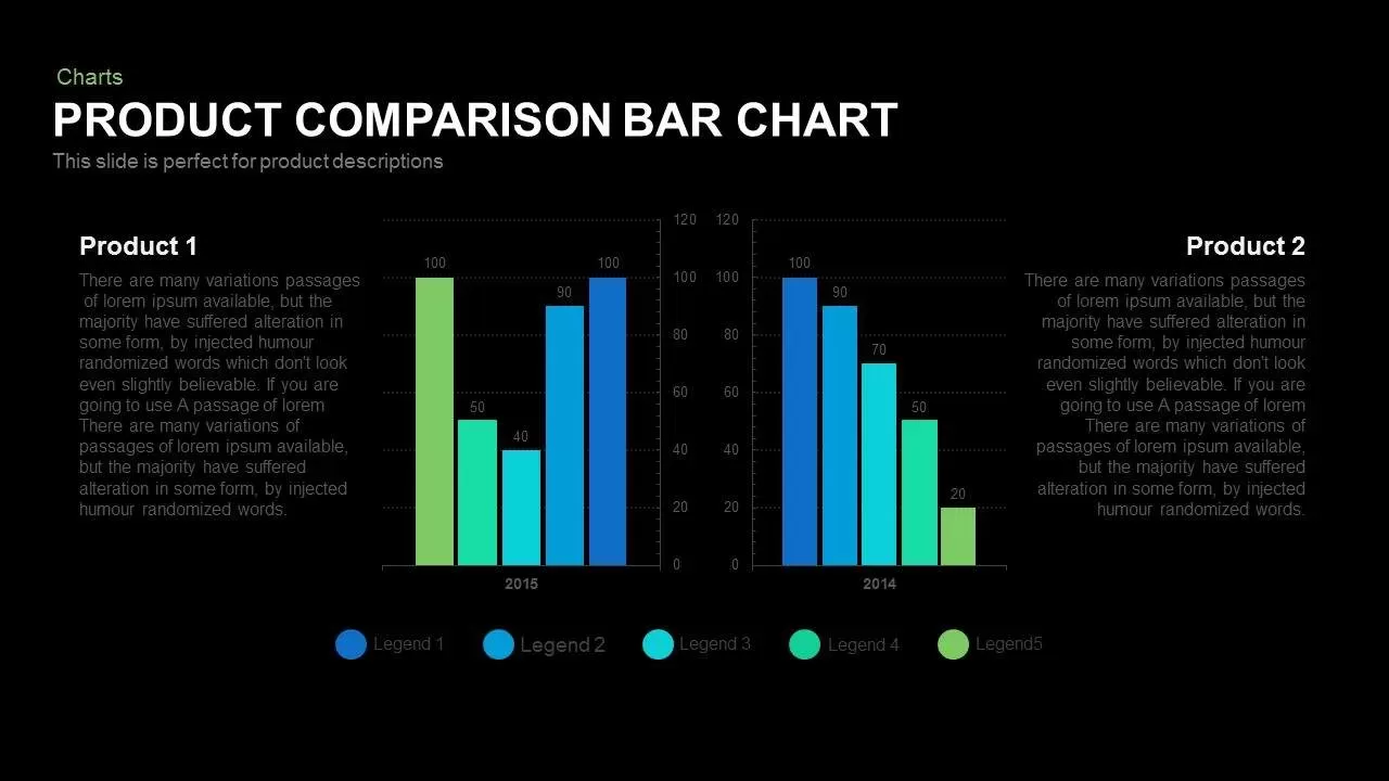
Leverage this versatile product comparison bar chart slide to juxtapose actual vs. target metrics, feature performance, or pricing tiers with professional clarity and impact. The design features grouped vertical bars—each representing two datasets—paired by category along the horizontal axis. Default color assignments (blue for Product A and orange for Product B) facilitate immediate visual differentiation, while optional gridlines, axis markers, and data labels ensure precise readability. Built entirely with editable vector shapes and master slide layouts, you can adjust bar widths, recolor segments to match your corporate palette, modify typography, and swap in custom vector icons without compromising visual fidelity or alignment. Precision snap-to-grid guides and subtle drop shadows maintain consistent spacing and depth, enhancing the minimalist aesthetic without cluttering the slide. A dedicated legend placeholder and axis titles provide context for your comparisons, while intuitive data callouts allow you to highlight percentage variances, conversion rates, or growth differentials alongside each bar.
The slide preserves high-definition clarity across devices and supports collaborative cloud editing in both PowerPoint and Google Slides. Intuitive placeholders simplify data entry—just update chart values in the embedded spreadsheet or adjust Google Slides graph properties—and the slide will auto-render. Whether you’re preparing monthly sales comparisons, software feature evaluations, or operational KPI dashboards, this template streamlines your workflow and ensures professional, polished results.
Who is it for
Sales managers, product marketers, business analysts, and financial planners will benefit from this slide when presenting side-by-side performance comparisons, feature benchmarking, or budget vs. actual analyses in boardroom briefings and stakeholder reviews.
Other Uses
Engineered for maximum flexibility, the modular framework supports expanding the number of categories or datasets by duplicating bar groups or adjusting axis ranges. Optional axis orientation can switch to a horizontal bar layout for alternate presentations, and gradient fill variants provide enhanced styling options. The robust master-slide setup guarantees that theme changes propagate across all chart elements instantly, maintaining brand consistency throughout your deck. High-definition output ensures crisp visuals in webinars and virtual workshops, while the clean flat design aligns seamlessly with modern presentation aesthetics. Use this slide to drive data-driven narratives and engage stakeholders through clear, impactful comparisons.
Login to download this file

Item ID
SB00578