


Efficiency Metaphor Powerpoint and Keynote Template
Description
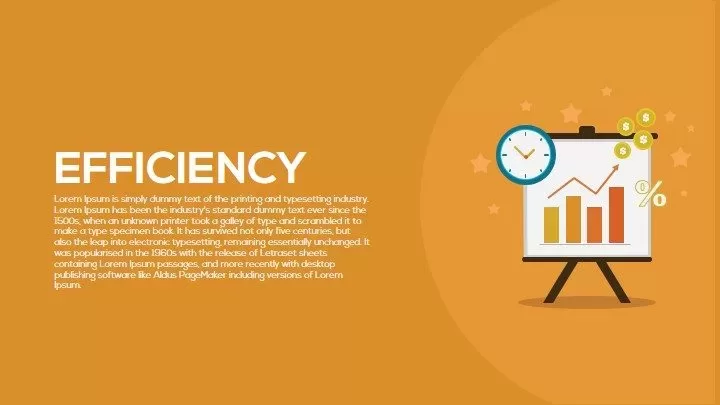
This efficiency dashboard slide uses a bold, uppercase “EFFICIENCY” headline in crisp white, set against a warm orange overlay that spans the full slide background. On the right, a clean easel graphic displays a multi-colored bar chart with ascending yellow, orange, and red bars, accented by floating dollar-coin icons and a stylized clock badge to symbolize time savings and cost optimization. Subtle star accents in the background introduce depth without distracting from the core message. The flat-design aesthetic, consistent padding, and intuitive composition ensure your audience instantly grasps the relationship between productivity, time, and revenue metrics. The headline area includes a placeholder for a concise subheading or summary beneath the main title, enabling presenters to provide context or highlight key data points. Color-themed accent shapes integrate seamlessly with corporate branding guidelines, allowing quick theme overrides via built-in slide masters.
Fully built with editable vector shapes and master-slide integration, this template empowers you to tailor every element in seconds. Swap the bar-chart hues to reflect your company’s branded palette, replace the clock icon with alternative time-management symbols, or adjust data placeholders to showcase actual KPIs, ROI projections, or performance benchmarks. Text boxes support both short headlines and extended descriptions in legible sans-serif fonts, while alignment guides simplify repositioning without manual adjustments. Fully compatible with PowerPoint and Google Slides, this slide preserves full resolution across devices and platforms, eliminating formatting issues and speeding up collaboration. Use slide-level animations to reveal chart elements sequentially, or duplicate and reorder slides to compare multiple scenarios. With this asset, you can deliver data-driven narratives that emphasize efficiency gains, operational improvements, and strategic value in any stakeholder presentation.
Who is it for
Operations managers, business analysts, and finance leaders will benefit from this slide when communicating productivity metrics, cost-savings studies, or performance reviews. Marketing executives and project managers can also use it to illustrate resource allocation, timeline adherence, and ROI optimization.
Other Uses
Beyond efficiency reporting, repurpose this design for quarterly business reviews, budget planning sessions, or executive dashboards. Adapt the bar chart to showcase sales growth analysis, customer acquisition metrics, or departmental performance comparisons. Its versatile layout supports any data-centric narrative across industries.
Login to download this file
Add to favorites
Add to collection

Item ID
SB00452