


Sales Bar Chart Powerpoint and Keynote template 1
Description
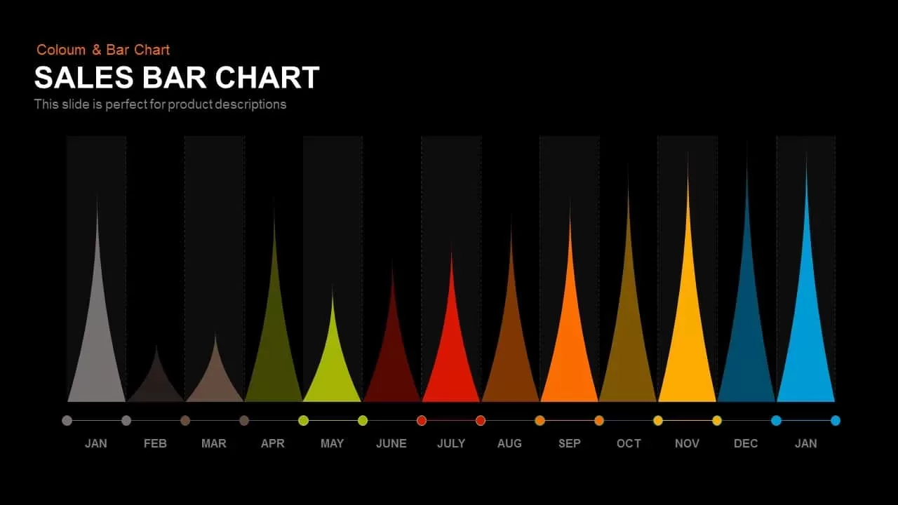
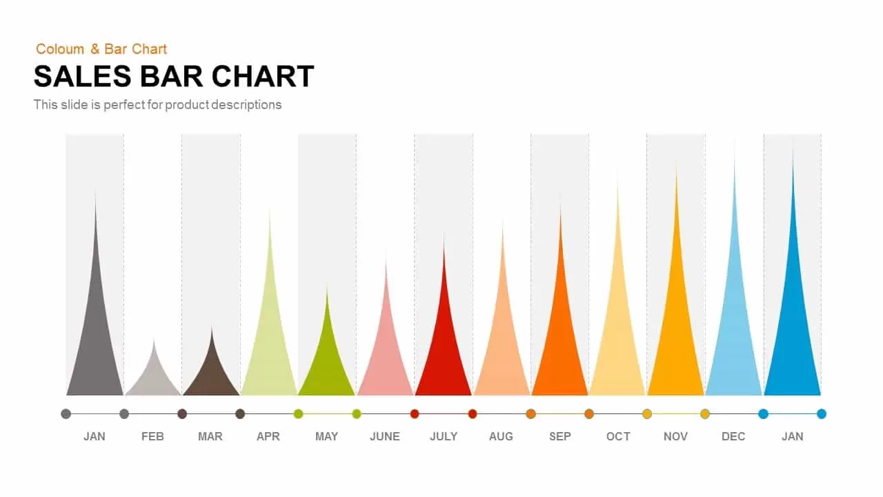
The Sales Bar Chart is an excellent visual tool for tracking performance and trends across the year. With its multi-colored bar design representing each month, it helps to quickly identify seasonal patterns, high and low sales periods, and any key fluctuations. The smooth gradient colors from gray, green, red, orange, yellow, to blue visually engage your audience while providing clear insights into monthly data. Ideal for business reports, presentations, or financial analyses, this chart enhances understanding by displaying the information in an easy-to-interpret format.
Who is it for
This slide is particularly useful for sales teams, marketing professionals, business analysts, and project managers who need to present monthly performance data, highlight trends, and make data-driven decisions. It's perfect for end-of-quarter reviews, annual reports, or strategy meetings where a clear visual representation of sales growth or decline is necessary.
Other Uses
Beyond sales, this bar chart can be used to track monthly project milestones, customer acquisition rates, marketing campaign performance, or even seasonal product demand. It can easily be adapted for use in various industries, including retail, finance, tech, and service-based sectors.
Login to download this file
Add to favorites
Add to collection

Item ID
SB00387