


Product Usage Analytics Powerpoint and Keynote template 1
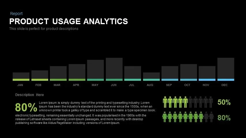
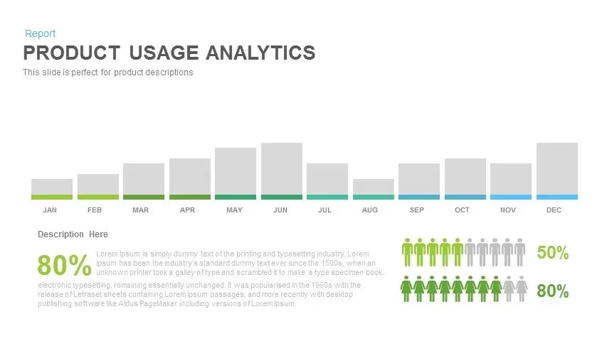
Harness this insightful product usage analytics slide to present monthly trends and key performance metrics with precision. The upper section showcases a horizontal bar chart illustrating usage data across twelve months, with color-coded base segments highlighting incremental values against neutral gray bars. Beneath the chart, a bold percentage figure emphasizes overall adoption rate or user engagement metric. To further reinforce key insights, two icon arrays illustrate discrete KPI thresholds—green human figures versus gray placeholders to denote 50% and 80% values—accompanied by matching percentage labels. All chart elements, icons, and text placeholders are fully editable vector objects, allowing users to adjust data values, swap colors, or replace icons effortlessly via built-in master layouts. Advanced chart settings enable you to switch between stacked and grouped views, adjust axis scales, and annotate peak months for deeper insights. Its modular layout also supports the inclusion of icons, images, or logos alongside data to reinforce brand identity. The clean white background and minimalist typography ensure optimum readability and uphold professional standards. Compatible with both PowerPoint and Google Slides, this template guarantees seamless cross-device rendering, preserving pixel-perfect clarity and layout consistency during remote or in-person presentations. Ideal for both executive summaries and deep-dive data presentations, this slide transforms raw metrics into a compelling narrative.
Who is it for
Product managers, data analysts, marketing teams, and executive stakeholders will find this slide invaluable for quarterly reviews, trend reports, and strategy sessions. Consultants and business development professionals can leverage the clear visual metrics to drive data-driven recommendations and stakeholder alignment.
Other Uses
Repurpose this framework to depict sales performance, ROI analysis, customer satisfaction scores, or financial forecasts. The flexible chart and icon placeholders also suit project status updates, operational dashboards, and workforce utilization reports.
Login to download this file
Add to favorites
Add to collection

Item ID
SB00373