Report Bar Chart Powerpoint and Keynote template
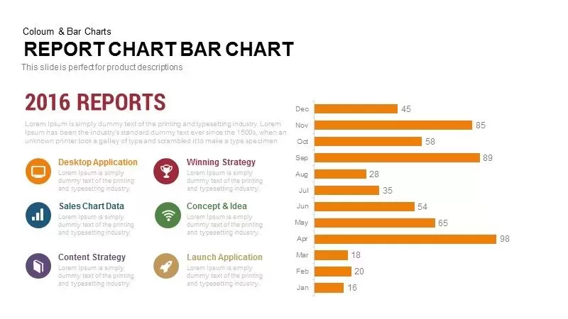
Elevate your annual reporting presentations with this professional horizontal bar chart slide, designed to showcase monthly performance metrics in a clear, data-driven format. The slide features a bold “2016 REPORTS” headline and supporting text on the left, complemented by six colored icon-based callouts that highlight key areas such as desktop applications, sales data, content strategy, winning strategies, conceptual ideas, and launch applications. Each icon is paired with a distinct color accent, reinforcing the connection between narrative insights and visual data points. On the right, a clean horizontal bar chart displays monthly values from January through December, with crisp orange bars and numeric labels that facilitate quick comparisons and trend analyses. Subtle gridlines, a 0–100 % axis scale, and minimalist sans-serif typography ensure your audience can interpret the data effortlessly.
Built with fully editable master shapes and vector graphics, this slide empowers you to customize every element to fit your brand guidelines. Easily modify bar lengths, change color schemes, replace icons, and adjust text placeholders to reflect your unique content. The layout supports rearrangement of icon callouts, legend details, and chart positioning, offering complete flexibility for different presentation contexts. Designed for both PowerPoint and Google Slides, the slide maintains pixel-perfect clarity across all devices and integrates seamlessly with collaborative workflows, enabling distributed teams to co-edit and refine content in real time.
Whether you’re presenting sales performance, marketing campaign results, or operational KPIs, this infographic slide provides a structured canvas for data storytelling. Highlight seasonal fluctuations, compare product-line metrics, or illustrate department achievements with confidence. The balanced composition keeps focus on critical insights, helping stakeholders make informed, data-driven decisions.
Who is it for
Marketing managers, sales directors, and business analysts will find this bar chart slide invaluable for presenting performance trends, monthly sales figures, and campaign results. Financial planners, operations teams, and executives can leverage the clear visual comparisons to support boardroom briefings, quarterly reviews, and data-driven decision-making with precision.
Other Uses
Repurpose this slide for budget tracking, marketing campaign analyses, production output reporting, or social media metrics reviews. Adjust bar colors and labels to map KPIs like customer acquisition, churn rates, or website traffic. Use the layout for resource allocation overviews, stakeholder updates, product lifecycle assessments, or investor pitches.
Login to download this file
Add to favorites
Add to collection


