


Circle Timeline Infographics Powerpoint and Keynote template
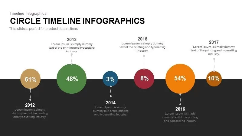
Illuminate trends with this circle timeline infographic slide, featuring percentage data points from 2012 to 2017. Six colored circles of varying sizes sit on a central horizontal axis that divides the slide into two contrasting zones: a white upper half for narrative callouts and a dark lower half to anchor the timeline. Each circle—warm brown 61% (2012), vibrant green 48% (2013), deep blue 3% (2014), rich red 8% (2015), bold orange 54% (2016), and golden yellow 10% (2017)—connects via dotted lines to editable date labels above or below the axis. The design leverages size to encode value and color to differentiate years, creating an instantly legible, visually engaging data story.
Fully built with native PowerPoint and Google Slides elements, this slide uses vector shapes, master layouts, and placeholder text for effortless editing. Simply adjust circle diameters to represent different metrics, recolor circles to match your brand palette, or reposition callouts to spotlight key insights. Extend the timeline by duplicating or deleting circles on the master slide; built-in guides ensure precise alignment. Because the graphic relies on editable shapes rather than images, you’ll maintain pixel-perfect clarity on any screen and can integrate subtle animations to guide audience focus.
Who is it for
This timeline is ideal for marketing professionals tracking campaign KPIs over multiple years, financial analysts presenting annual growth figures, and project managers monitoring milestone completions. Consultants and educators can use it to compare historical data, illustrate progress toward strategic goals, or visualize survey results with impact and clarity.
Other Uses
Repurpose this slide to display product adoption rates, customer satisfaction trends, research findings, or financial projections. Use the size-encoded circles to highlight performance benchmarks, budget allocations, or resource utilization. Duplicate and recolor markers to accommodate additional years, data series, or departmental comparisons for maximum versatility.
Login to download this file

Item ID
SB00335