


Cone chart Powerpoint template
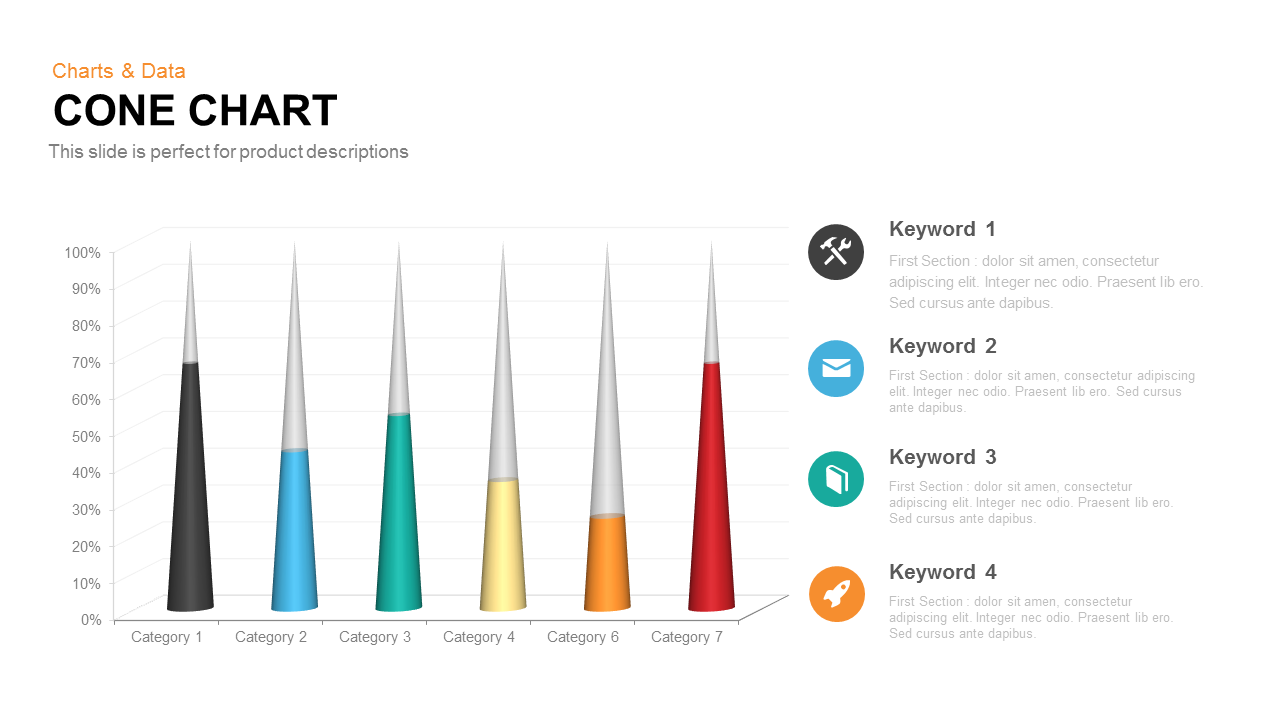
Elevate your data storytelling with this versatile 3D cone chart slide, designed to showcase category-based percentage metrics with striking visual depth. Each of the seven cones is rendered in distinctive hues—jet black, sky blue, aquamarine green, warm yellow, vivid orange, and crimson red—scaled to precise values on a 0–100% vertical grid. Subtle gradients and drop shadows enhance dimensionality, while clean gridlines and axis markers ensure fast comprehension. A spacious layout pairs the chart with four icon-text callouts, enabling you to highlight critical insights, feature benefits, or KPIs alongside the data. Intuitive navigation arrows facilitate step-by-step storytelling or sequential slide series.
Built for seamless customization, this slide offers editable master shapes, color fills, and text placeholders. Update category names, adjust percentage points, and swap icons in seconds to align with your corporate palette and brand guidelines. The minimalist typography and uncluttered white background keep focus on your numbers and narrative. Fully optimized for both PowerPoint and Google Slides, the design guarantees pixel-perfect clarity on screens of all sizes, streamlining co-authoring and remote presentations.
Ideal for marketing performance reviews, product launch briefs, financial reporting, and competitive analyses, this cone chart also integrates effortlessly into executive dashboards or sales pitch decks. Whether you are tracking sales conversion rates, market share distribution, customer satisfaction scores, or project completion percentages, this slide empowers you to present complex information with simplicity and impact.
Beyond percentage comparisons, repurpose this template for illustrating life cycle stages, resource allocation tiers, risk severity scales, or any scenario where graduated visualization enhances understanding. Simply duplicate, reorder, or recolor cones to match your data set, and leverage the icon callouts to add context or action items. With this slide in your toolkit, you can drive clarity, engagement, and data-driven decision-making across teams and audiences.
Who is it for
Marketing managers, product managers, sales directors, and business analysts will benefit from this cone chart slide when comparing category-based performance metrics. Executive teams, consultants, and project leads can leverage the clear visual hierarchy to communicate KPI trends, market share distribution, and conversion rate analyses with clarity and confidence.
Other Uses
Beyond comparative charts, this slide can illustrate sales funnel progression, product lifecycle stages, resource allocation tiers, or risk severity assessments. By customizing cone colors and icons, you can repurpose it for project roadmaps, stakeholder impact analyses, training modules, or executive dashboard highlights across diverse industries and functions.
Login to download this file
Add to favorites
Add to collection

Item ID
SB00313