Section Title Chart
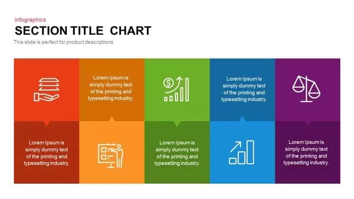
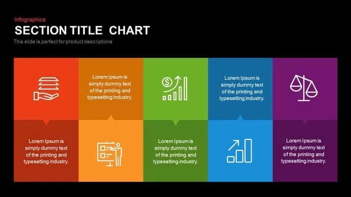
Leverage this visually striking infographic slide featuring ten equal-sized colored blocks arranged in a two-row grid against a rich black background. Each block contains either a crisp white icon or an editable text placeholder, providing a flexible canvas to highlight product features, service categories, performance metrics, or section headings with instant visual impact. The bold palette—spanning reds, oranges, greens, blues, and purples—ensures each segment stands out, while the dark theme adds contemporary flair and enhances on-screen readability.
Designed for effortless customization, this slide includes vector-based shapes and master slide support so you can quickly swap icons, update color fills, or adjust text zones without disturbing the grid alignment. Subtle speech-bubble pointers beneath each top-row block and above each bottom-row block guide viewers’ focus to key points, reinforcing the relationship between graphic elements and descriptive copy. Built-in font-based icons scale perfectly at any resolution, and strategic spacing preserves clarity even when adding lengthy descriptions or data labels.
Optimized for both Microsoft PowerPoint and Google Slides, this template guarantees pixel-perfect results across platforms. Replace placeholder text with your own headlines and body copy, reorder the blocks to reflect priority tiers, or duplicate the grid to extend beyond ten sections. Whether you’re crafting a product roadmap, outlining team responsibilities, or comparing service offerings, this chart delivers a clean, professional layout that accelerates slide creation and minimizes formatting errors.
Who is it for
Marketing managers, product strategists, and sales leaders will appreciate this slide’s ability to showcase multiple features or comparisons at once. Consultants, business analysts, and workshop facilitators can also leverage the ten-block design to structure insights and guide stakeholder discussions.
Other Uses
Repurpose this layout to map process stages, display competitive analyses, illustrate roadmap milestones, or structure agenda items. It’s equally effective for visualizing organizational units, skill assessments, or multi-category dashboards in executive reports and training materials.
Login to download this file
Add to favorites
Add to collection


