


Table with Column
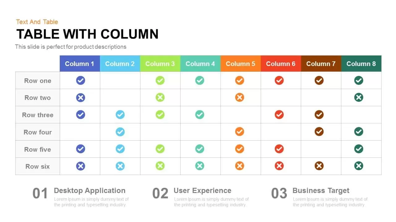
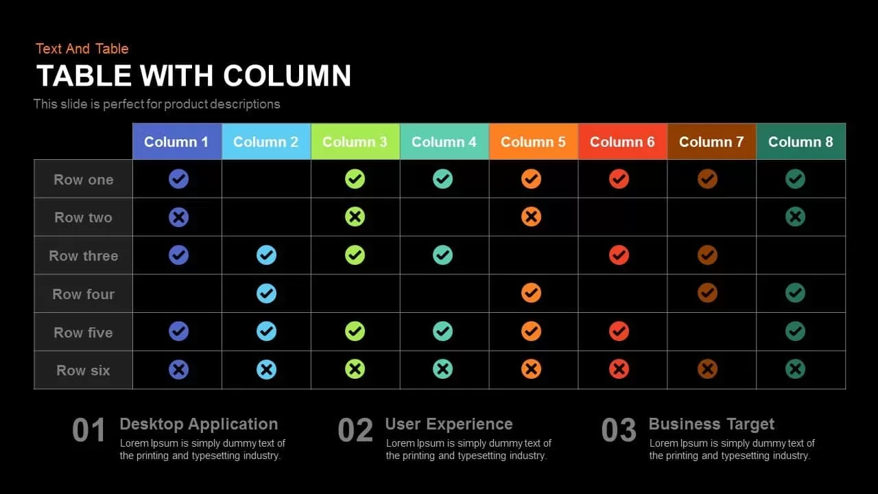
Use this feature comparison table slide to present up to eight core features across multiple product offerings or categories. Each column header is distinguished by vibrant color palettes — including blue, cyan, green, orange, red, brown, and dark green — while clear checkmark and cross icons instantly convey availability or status at a glance. The grid layout accommodates six rows of data, making it ideal for product descriptions, plan comparisons, or service level breakdowns. Beneath the table, three spotlight sections — Desktop Application, User Experience, and Business Target — offer additional space to elaborate on key priorities or strategic focuses. Every placeholder is fully editable: adjust text, change colors, swap icons, and resize shapes with ease through built-in master slides and intuitive placeholders. This design maintains crisp clarity in both 16:9 widescreen and 4:3 standard formats and uses free web fonts for maximum compatibility. Whether you need to showcase tiered software modules, highlight UX features, or map business objectives side-by-side, this slide streamlines your storytelling. Insert it into any pitch deck, product demo, or executive summary for polished, professional results without manual formatting. The clean white background and simple grid structure draw attention directly to your content while the bold header bars inject energy and focus. Save time on design and deliver clear insights — simply replace the sample text and icons to align with your brand guidelines and launch your presentation in minutes. Built for both PowerPoint and Google Slides, the layout leverages slide masters and placeholder objects to ensure zero formatting headaches. Customize icons, fonts, and layouts to suit your brand style. The responsive design keeps all elements aligned and pixel-perfect on HD displays and projectors alike.
Who is it for
Product managers, marketing teams, and sales leaders can harness this table slide to compare feature sets across multiple software plans or service levels. UI/UX designers will appreciate its clear iconography and color coding for showcasing functionality roadmaps. Business analysts and consultants can adapt the grid to present audit findings or gap analyses. Educators, trainers, and workshop facilitators will find it useful for illustrating concept checklists or progress matrices.
Other Uses
Beyond product comparisons, repurpose the table for pricing tiers, contract clauses, or vendor evaluations. Swap checkmarks for status indicators to track project milestones, risk factors, or compliance requirements. Use the numbered callouts below the grid to summarize key takeaways, agenda items, or next steps. With minor tweaks to color schemes and text, the slide also makes an engaging dashboard widget, an internal audit summary, or a detailed GDPR checklist.
Login to download this file
Add to favorites
Add to collection

Item ID
SB00288