


Pie Chart PPT Presentation Template
Description
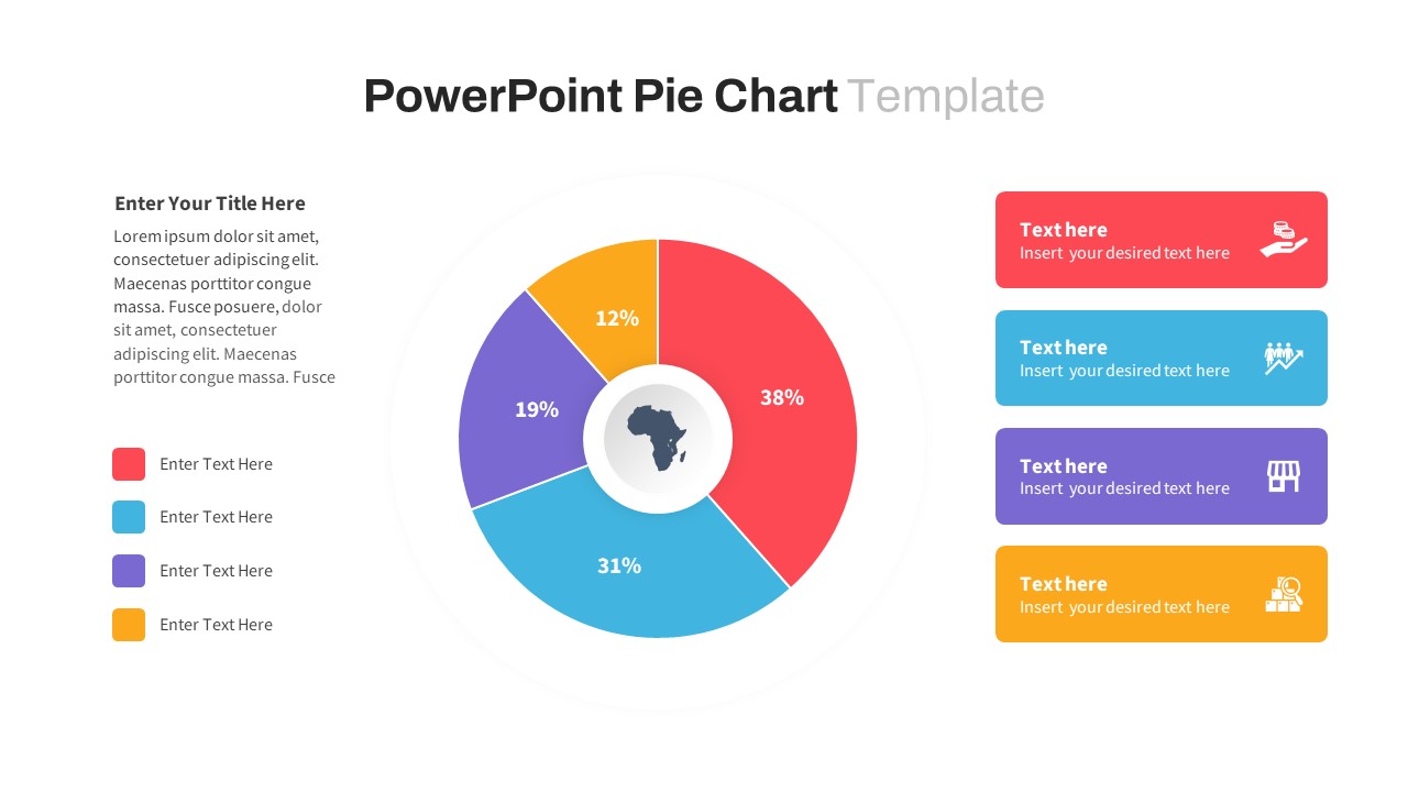
Visualize your data with clarity using this Segmented Pie Chart Infographic, designed for impactful storytelling across business, marketing, and analytics contexts. The central donut-style pie chart features four vividly colored segments—red (38%), blue (31%), purple (19%), and orange (12%)—with clean numerical labels and an Africa icon at the core for optional regional context. Each color-coded segment corresponds to matching callout boxes on the right side, complete with editable icons and text blocks for category descriptions or insights.
The layout uses a modern flat design with generous white space, ensuring optimal readability and professional polish. On the left, a placeholder for a short description or title provides room for narrative framing or additional context. The template’s structured, balanced format makes it ideal for comparative breakdowns, resource allocation summaries, market segmentation, or survey results.
Fully editable in PowerPoint and Google Slides, this chart allows effortless updates—change colors, icons, or values to suit any project need. Whether used in reports, dashboards, or executive presentations, this slide transforms data into compelling visual stories that engage and inform.
Who is it for
Perfect for data analysts, consultants, marketers, finance professionals, and project managers needing to communicate segmented data clearly and visually.
Other Uses
This slide can also be adapted for product portfolio analysis, budget overviews, demographic studies, risk assessments, or departmental KPIs. Modify the center icon to reflect any region or theme.
Login to download this file

Item ID
SB04002