


Four Section Chart
Description
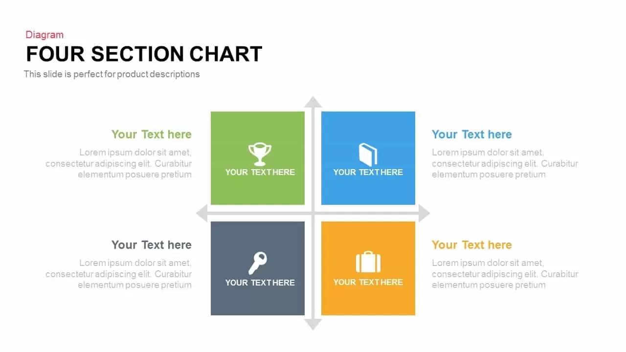
Leverage this four-section comparison chart slide to present quadrant analyses, category breakdowns, or multi-criteria evaluations with absolute clarity. The central grid arranges four equally sized square panels in a two-by-two format, each featuring a prominent icon placeholder and headline text—perfect for grouping related concepts such as market segments, risk assessments, or product portfolios. Bold flat colors of green, blue, dark gray, and orange create strong visual separation while enabling easy association with your brand palette. Crisp typography and generous white space ensure that both titles and supporting text stand out on screen and in print, making the layout ideal for executive briefs, strategy workshops, or client proposals.
Built on master slides for both PowerPoint and Google Slides, this template delivers fully editable vector graphics, intuitive icon placeholders, and customizable text boxes. Simply swap icons to match your content, adjust square dimensions for different orientations, or recolor segments in seconds to reflect brand guidelines. Subtle alignment guides and organized layers maintain pixel-perfect consistency across all slides, eliminating tedious manual adjustments and version-control headaches. The minimal flat design ensures seamless integration with a variety of corporate and startup themes, while optional entrance animations such as fade-ins or zoom effects guide audiences through each quadrant in a dynamic, narrative-driven flow.
Ideal for a wide range of applications, this chart can illustrate SWOT analyses, customer segmentation, competitive comparisons, or financial performance quadrants. Duplicate or remove squares to accommodate three or five categories, or combine with supporting slides to build comprehensive dashboards. Use the layout to highlight key performance indicators, map strategic objectives, or showcase team strengths and weaknesses. With its flexible structure and high-resolution clarity, the four-section comparison chart empowers presenters to communicate complex information succinctly, foster stakeholder alignment, and drive data-driven decisions with professional polish.
Who is it for
Marketing strategists, product managers, and business analysts will find this slide invaluable for mapping market segments, comparing competitive offerings, and presenting executive-level insights.
Other Uses
Repurpose this diagram to showcase SWOT quadrants, feature-set comparisons, or budget allocations. Extend or reduce squares to fit your narrative, or integrate data callouts and percentage labels to emphasize critical metrics.
Login to download this file

Item ID
SB00268