


four section Circle Diagram1
Description
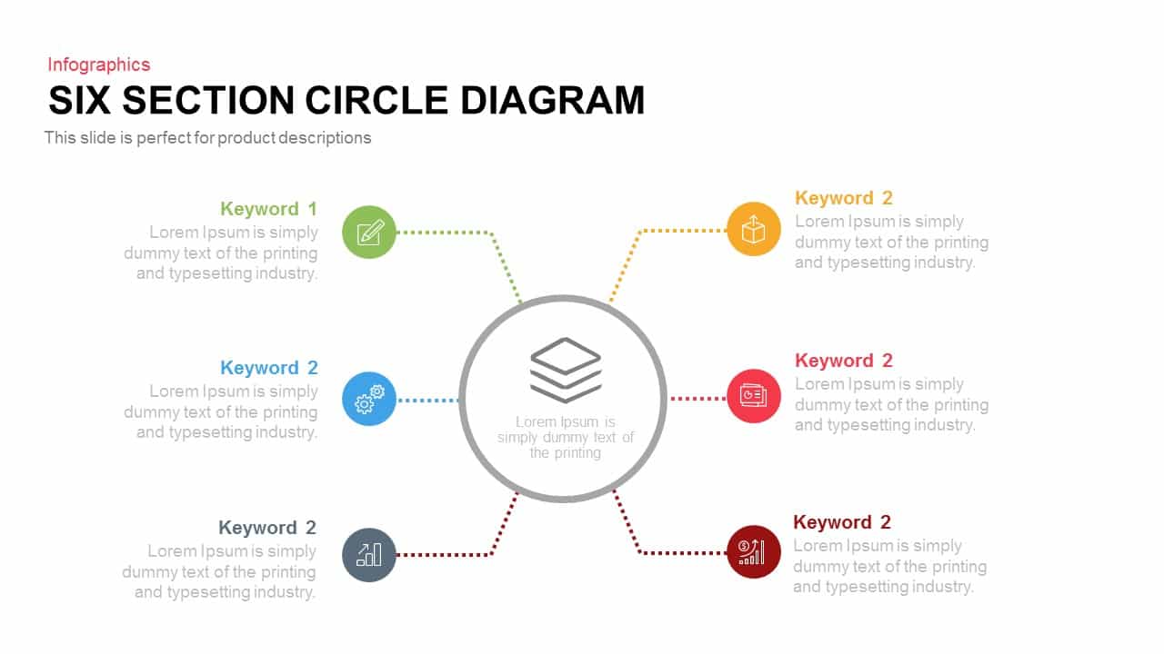
Leverage this six-section circular diagram slide to showcase component relationships, system overviews, or hub-and-spoke processes in a balanced radial layout. A central hub anchors six color-coded, dotted-path spokes, each terminating in a circular icon representing functions such as content planning, development, analytics, documentation, finance, and deployment. Vibrant hues of green, amber, cerulean, crimson, slate, and gold pop against a clean white background, while subtle drop shadows and crisp typography add depth and focus. The vector shapes maintain crisp resolution whether projected in large boardrooms or printed as handouts, ensuring information remains sharp across scenarios.
Designed for seamless editing in both PowerPoint and Google Slides, this template features fully editable vector graphics, master layouts, and intuitive placeholders. Easily swap icons, update labels, adjust segment angles, or recolor elements to match your brand palette. Alignment guides and organized layers ensure precision and consistency across slides, accelerating slide creation and eliminating version-control issues. Apply subtle entrance animations—like radial fades or motion paths—to reveal each segment sequentially and guide audience attention through your narrative. The flat, modern aesthetic aligns with corporate and startup visuals alike, making this diagram ideal for strategy sessions, team workshops, or client briefings.
Who is it for
Project managers, product teams, and business analysts will find this slide invaluable for mapping component workflows, illustrating system architectures, or presenting department overviews. Marketing strategists, consultants, and educators can also leverage the radial layout for training modules, audit frameworks, or operational dashboards.
Other Uses
Repurpose this diagram to depict organizational structures, audit cycles, risk-management processes, or customer-journey touchpoints. Duplicate spokes to expand beyond six segments, reorder or stack segments for alternative flows, or integrate data callouts to highlight KPIs and metrics. Use contrasting icons to differentiate functions or overlay labels for hierarchical views. Ideal for executive dashboards, quarterly planning, or stakeholder workshops, this versatile infographic adapts to a broad range of industries and presentation contexts.
Login to download this file

Item ID
SB00264