


Spline Chart PowerPoint slide
Description
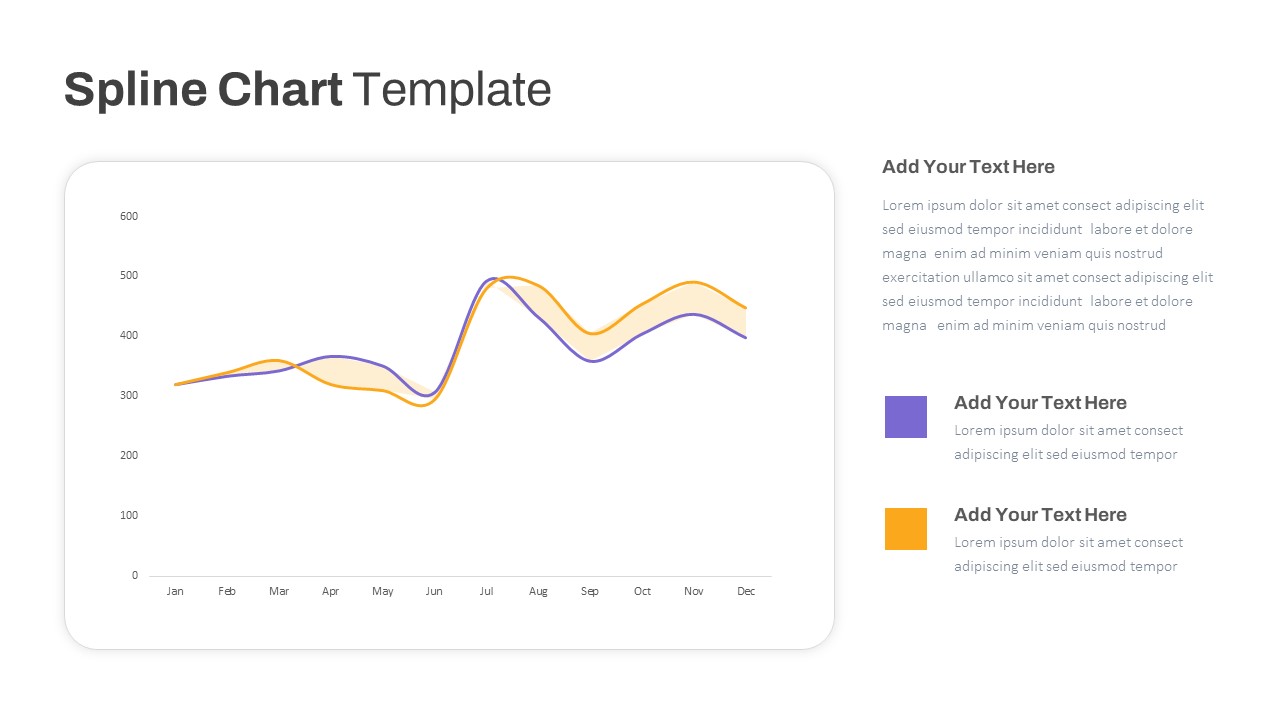
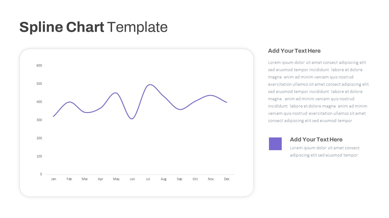
Leverage this multipurpose spline chart template to visualize data trends, seasonal fluctuations, and performance metrics with smooth, curved line segments. The pack includes three layouts: a single-series chart for a focused monthly overview, a dual-series overlay with shaded divergence areas, and a triple-series comparative view to track up to three metrics simultaneously. Each slide features a rounded-corner chart frame, subtle gridlines, and modern sans-serif typography, complemented by editable legends and color-coded data markers. Built on master slides for PowerPoint and Google Slides, you can resize vector shapes, swap theme colors, adjust axis scales, or update data in seconds. A clean white background and minimal drop shadows ensure a distraction-free display that adapts seamlessly to corporate or creative branding. Intuitive placeholder controls and alignment guides accelerate slide creation under tight deadlines, while high-resolution elements maintain pixel-perfect clarity across displays and print. Ideal for quarterly reports, sales forecasts, website traffic analysis, or any time-series presentation, this spline chart toolkit empowers you to communicate complex trends clearly and persuasively.
Who is it for
Marketing analysts, financial planners, project managers, business intelligence teams, and data journalists will benefit from these spline chart layouts when presenting time-based data trends, KPI progress, or comparative performance analyses.
Other Uses
Repurpose these slides for revenue projections, budget vs. actual comparisons, customer engagement metrics, product usage trends, or resource planning forecasts. Duplicate and recolor series to suit any multi-metric narrative.
Login to download this file

Item ID
SB03792