


Population Pyramid Chart PowerPoint Template
Description
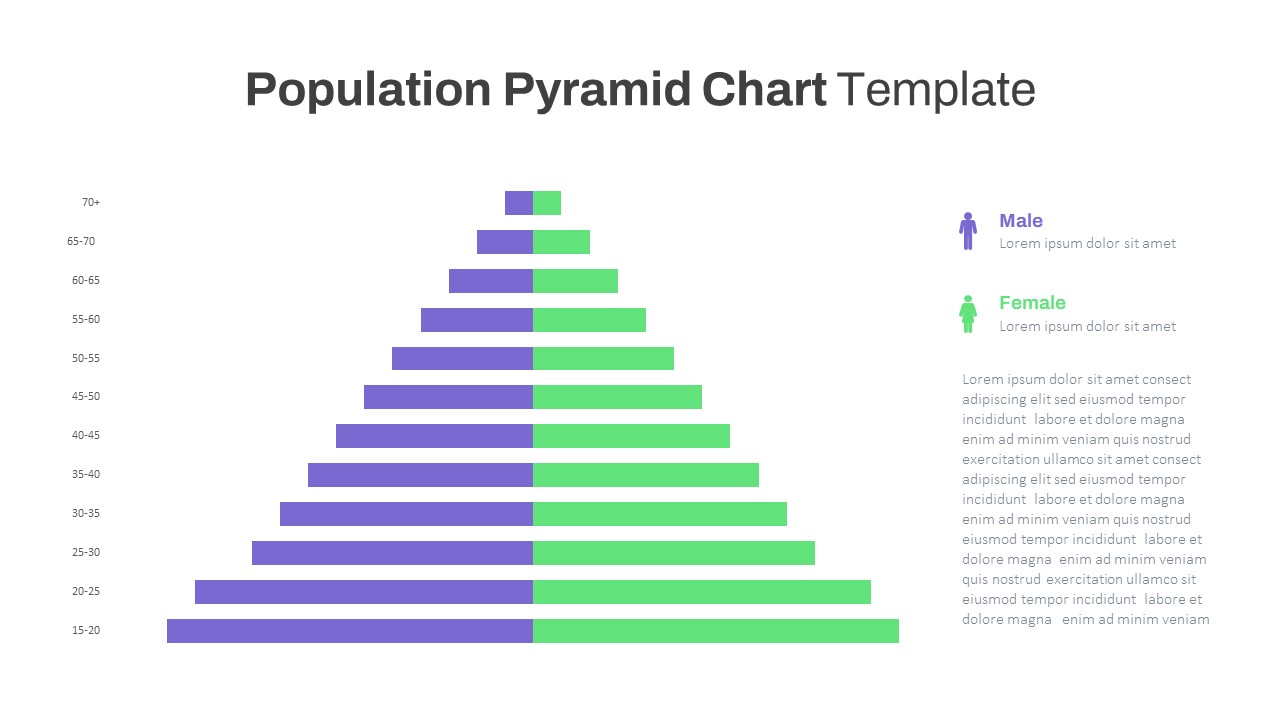
This editable population pyramid infographic displays gender-segmented age groups across eleven five-year cohorts (15–20 through 70+) on a crisp white master slide. Purple bars extend left for male values and green bars extend right for female values, each built from vector shapes for perfect scaling and recoloring. Age-range labels sit along the vertical axis, while matching legend icons and text placeholders on the right provide context. Hidden guide layers let you adjust cohort labels, add or remove cohorts, swap color themes, or toggle bar orientations without disrupting alignment. Subtle drop shadows add depth to the bars, and theme-font controls ensure typographic consistency across both PowerPoint and Google Slides. Whether presenting demographic analyses, workforce distributions, or market segment breakdowns, this pyramid chart combines clarity and flexibility for professional storytelling.
Who is it for
Demographers, HR analysts, and marketing researchers will leverage this pyramid to visualize age and gender distributions for population studies, workforce planning, or customer-segment analyses.
Other Uses
Repurpose this layout for survey-response breakdowns, beneficiary-group overviews, enrollment-cohort analyses, or any context requiring a mirrored bar-segment comparison across categories.
Login to download this file
Add to favorites
Add to collection

Item ID
SB03793