


Stacked Waterfall Chart ppt slide
Description
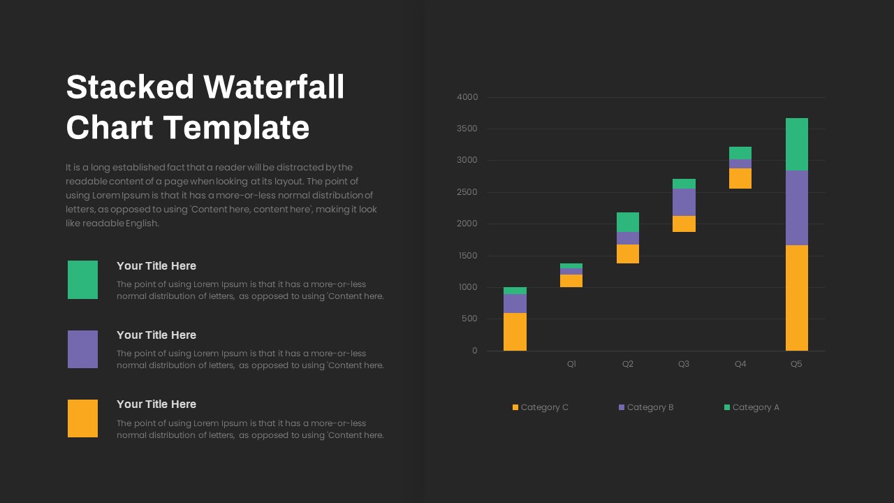
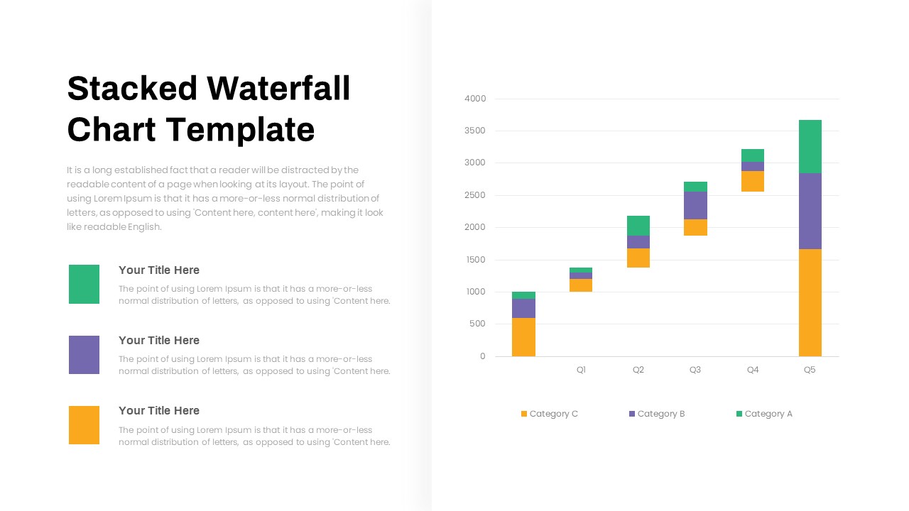
This slide features a three-series stacked waterfall chart built entirely with editable vector shapes on a clean white master slide. Five vertical columns (Q1–Q5) display cumulative values for Category C (orange), Category B (purple), and Category A (green), with precise data labels on each segment. A legend on the left uses matching color swatches, icon placeholders, and text blocks for each series, all linked via theme fonts. Hidden guide layers let you adjust category labels, add or remove series, switch between flat and gradient fills, or toggle gridlines in seconds. Subtle drop shadows add depth, while grouped objects ensure bulk formatting of colors and fonts. Fully compatible with both PowerPoint and Google Slides, this template preserves exact spacing, scaling, and formatting across platforms, making it ideal for illustrating cumulative data trends, financial waterfalls, or component breakdowns with professional polish.
Who is it for
Data analysts, financial planners, and marketing managers will leverage this stacked waterfall chart to present product revenue breakdowns, cost-component analyses, or cumulative performance metrics over time.
Other Uses
Repurpose this template for project budget waterfalls, ROI analyses, resource-allocation breakdowns, or any scenario requiring clear, stacked data visualization. Simply update labels, swap colors, or adjust segment heights to suit your narrative.
Login to download this file
Add to favorites
Add to collection

Item ID
SB03772