


Timeline-Bar-Chart-PowerPoint
Description
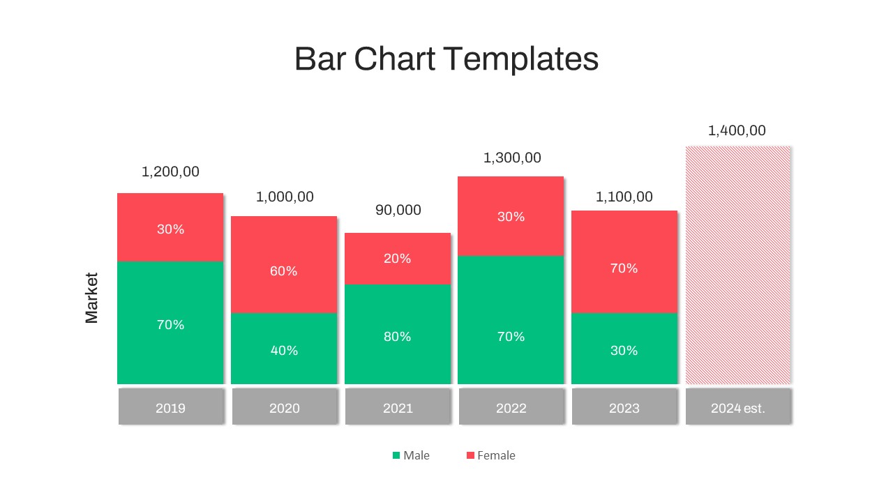
Visualize year-over-year demographic shifts with this stacked gender bar chart slide. A clean white canvas hosts six vertical columns for January through August metrics, plus an estimated bar for 2024. Each column is divided into green “Male” and red “Female” segments—complete with percentage labels—to clearly illustrate changing ratios. Orange data labels atop each column display total values, while a concise legend decodes color mappings. The 2024 estimate column is rendered in a red hatch pattern to distinguish projected data from actuals.
Built on master slides, every element can be customized in seconds. Swap the green and red fills for your brand colors, adjust column widths, or modify percentage labels without breaking the layout. Vector-based shapes ensure crisp visuals at any resolution, whether on a projector, printed handout, or HD display. Gridlines and axis labels remain legible in any aspect ratio, and right-to-left language support makes this slide globally ready.
Intuitive grouping and descriptive layer names simplify edits—duplicate bars, add new data points, or conceal the 2024 estimate with a click. A hidden dark-mode variant preserves contrast in dim environments, while preconfigured entrance animations reveal each column or data series sequentially to guide audience focus.
Ideal for financial analysts, HR teams, and market researchers, this bar chart template empowers you to tell data-driven stories with clarity and impact. Whether you’re comparing survey results, tracking sales by gender, or presenting workforce diversity trends, this slide combines precision and polish to keep stakeholders engaged.
Who is it for
Financial analysts, marketing managers, and HR professionals will benefit from this slide when reporting demographic breakdowns, workforce diversity metrics, or survey results. Consultants and educators can also leverage its clear structure for teaching data visualization best practices.
Other Uses
Repurpose this layout for product segment comparisons, budget breakdowns, customer satisfaction surveys, or any scenario requiring stacked category analysis. Simply update segment labels, color mappings, and data values to suit your narrative.
Login to download this file
Add to favorites
Add to collection

Item ID
SB03747