


Vertical Dot Chart PowerPoint Template
Description
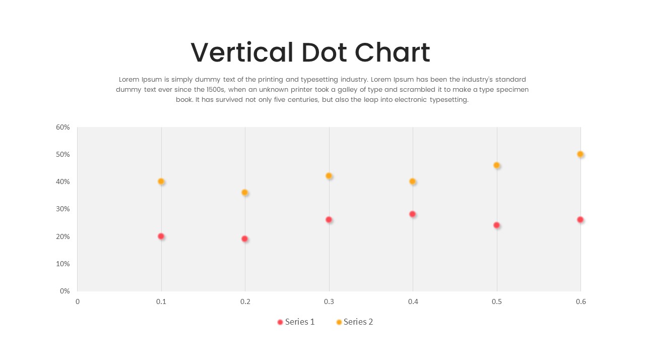
Present precise, side-by-side comparisons with this multi-series vertical dot chart slide. A clean white canvas features six evenly spaced vertical axes (0.1 to 0.6), each accented by subtle alternating gray bands to guide the eye. Two distinct data series—one in vibrant red and one in warm yellow—are plotted as circular markers along percentage values from 0% to 60%. A concise legend at the bottom clarifies series names, while a shaded top-right text box offers space for an executive summary or descriptive note.
Built on master slides, every element—from axis labels and gridlines to marker size and color—can be tailored in seconds. Swap axis scales, recolor data points, or adjust band shading to match your brand palette. Vector-based assets ensure crisp clarity on large screens or printed reports, and intuitive layer names simplify edits. Optional entrance animations can sequentially reveal each series or data point, drawing attention to key performance shifts.
Fully compatible with PowerPoint and Google Slides, this chart maintains pixel-perfect fidelity across devices and supports multiple aspect ratios. Right-to-left language support makes it ideal for global audiences. Whether you’re reporting quarterly KPIs, showcasing product comparisons, or illustrating survey results, this slide empowers you to communicate complex data with clarity and professionalism.
Who is it for
Financial analysts, marketing managers, and operations leads will find this slide invaluable for comparing performance metrics over time. Consultants, educators, and C-suite executives can also leverage its clear design to teach data literacy or highlight strategic insights.
Other Uses
Repurpose this layout for customer satisfaction scores, competitive benchmarking, sales funnel stage comparisons, or as a component in an executive dashboard. Simply swap marker colors, adjust axis labels, or replace the legend icons to fit any context.
Login to download this file
Add to favorites
Add to collection

Item ID
SB03714