


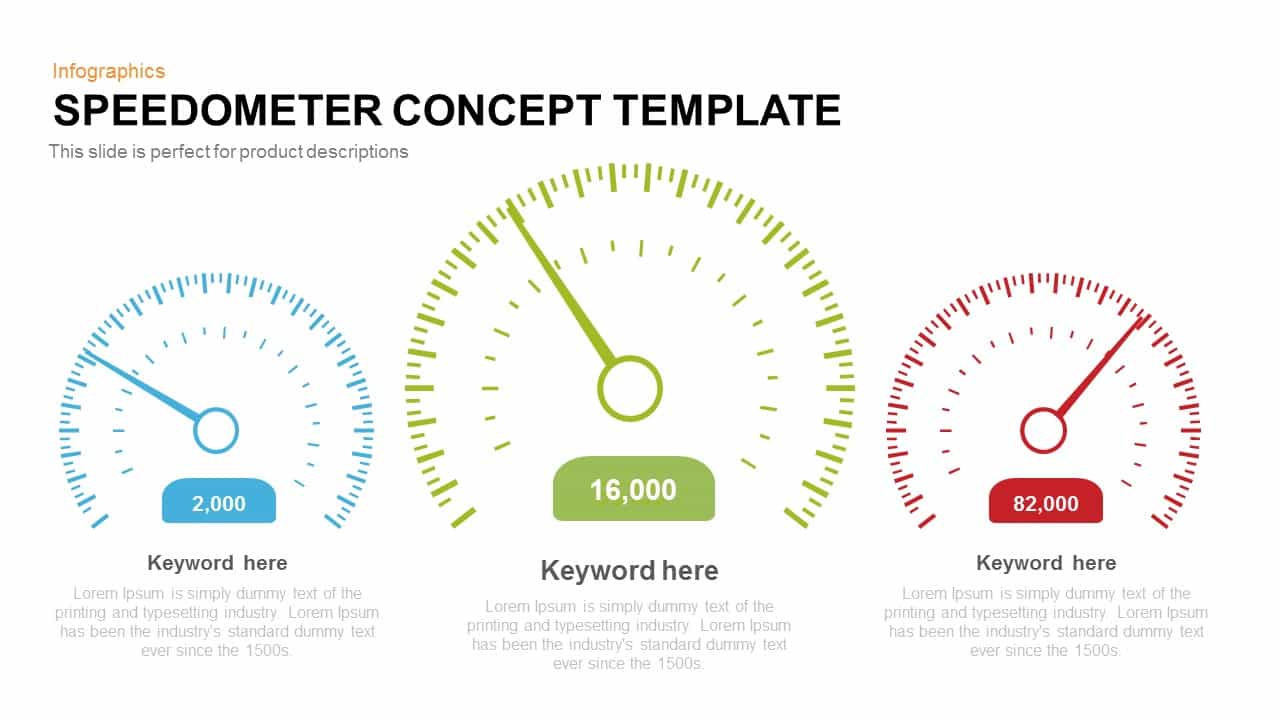
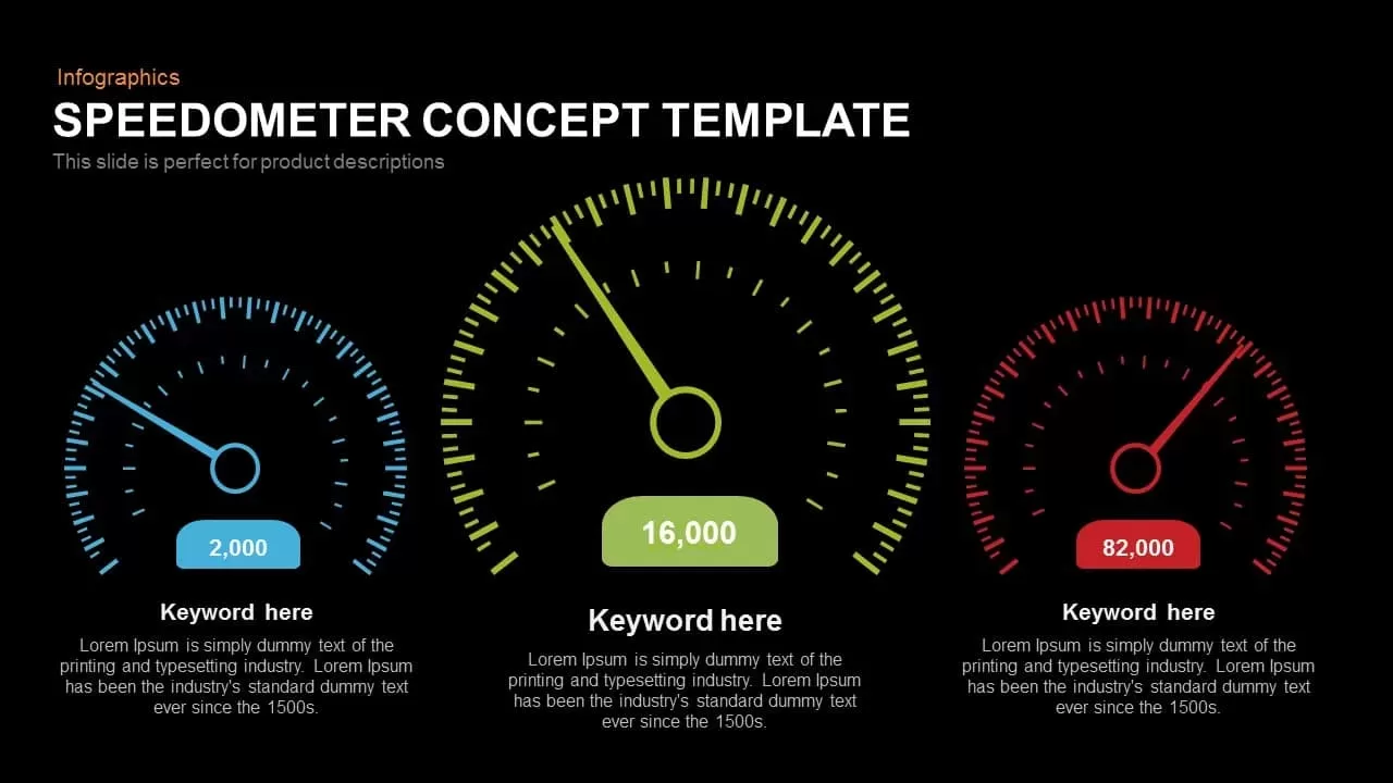
Speedometer Concept Template
Description
Showcase your key performance indicators (KPIs) with this speedometer infographic slide, designed to deliver instant metric insights through three dynamic gauge charts. The centrally positioned, larger gauge engages attention for your primary statistic, while the two flanking meters offer clear side-by-side comparisons. Each dial is fully customizable: update needle positions, numeric labels, and color schemes in seconds via master slide controls. The flat vector graphics, combined with minimalist scale markings, create a modern visual language that maintains focus on data rather than decorative elements. Leverage intuitive placeholders to add titles and brief descriptions below each gauge, ensuring your audience understands the context at a glance. This layout supports multiple use cases—from sales velocity tracking and website performance monitoring to operational throughput analysis—making it a versatile addition to executive dashboards, quarterly reports, and investor pitches.
Built for both PowerPoint and Google Slides, this template guarantees pixel-perfect clarity and seamless cross-platform compatibility. Resize the gauges, adjust color accents, or duplicate slides to accommodate additional metrics without compromising design integrity. The generous white space and balanced margins promote readability, while the consistent typeface hierarchy guides viewers through your narrative. Optimize slide masters to reflect corporate branding or event themes, and eliminate formatting bottlenecks across teams. Whether you’re presenting at a board meeting, sales kickoff, or status update, this speedometer concept empowers you to communicate complex data with simplicity and impact.
Use color-coded performance zones—red, yellow, and green—to illustrate thresholds and highlight alert levels. Embed legends and annotations to guide viewers through datasets. The slide includes both light and dark theme variants and concise documentation for rapid customization. Analysts and marketing teams can adapt this toolkit to measure sales targets, service levels, or customer satisfaction.
Who is it for
Data analysts, marketing managers, product owners, and operations teams will benefit from this speedometer slide to communicate key metrics and performance benchmarks. Sales directors and executive leadership can leverage the clear comparative gauges in investor updates, board presentations, and quarterly reviews. UX designers and consultants can also use this asset to illustrate user engagement and system throughput.
Other Uses
Beyond dashboard reports, repurpose these gauges to visualize project sprint progress, budget utilization, risk assessments, or customer feedback scores. Resize or duplicate meters to accommodate additional categories, and integrate them into process diagrams or roadmaps. The speedometer concept also works for fundraising milestones, recruitment targets, or training evaluations where progress tracking is essential.
Login to download this file

Item ID
SB00236