


Mekko Chart ppt Template

Description
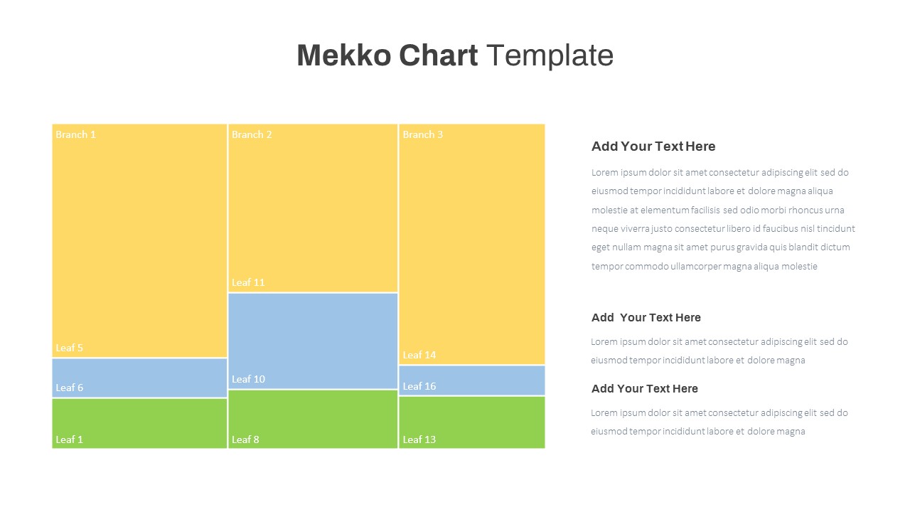
Leverage this Mekko Chart template to display category branches and proportional leaf segments in a mosaic layout. The slide features three vertical branches—Branch 1, 2, and 3—colored in yellow as primary segments. Within each column, leaf nodes are represented as rectangular blocks in blue and green hues, proportionally sized to reflect value distribution. Use the adjacent text placeholders to describe insights, compare segment contributions, or highlight key metrics. The clean white background and minimal typography ensure data remains the focal point. Designed for both PowerPoint and Google Slides, the chart uses customizable shapes and color palettes that allow rapid editing via master slide controls. Adjust branch widths, reorder leaf segments, and swap colors in seconds. The template includes three text callouts aligned to the right for contextual commentary or data narratives.
The mosaic arrangement of branches and leaves visually communicates relative proportions, making it ideal for market share analysis, resource allocation, or budget breakdowns. Each branch column can be resized to represent total category values, while leaf segments within offer granular subcategory insights. With built-in placeholder text on the right, presenters can annotate key findings, call out anomalies, or summarize action items. The color scheme uses yellow for top-level categories, blue for mid-tier segments, and green for base-level elements. Easily update these colors via the theme palette to align with corporate branding. The clean grid alignment and consistent spacing maintain visual harmony and guide viewer focus. Because all shapes are vector-based, resizing or recoloring does not degrade quality. The template supports direct editing on both desktop and web versions of PowerPoint and Google Slides, ensuring collaboration across teams. Animations can be applied to highlight individual branches or leaves sequentially, and notes sections allow for speaker cues. This Mekko Chart template accelerates the creation of sophisticated data-driven slides without the need for external plugins or manual alignment, saving valuable time.
Duplicate slides to compare different scenarios, enabling clear before-and-after analyses or segmentation shifts.
Who is it for
Data analysts, marketing managers, and financial planners will benefit from this chart when illustrating market share breakdowns, budget allocations, or product portfolio analyses. Business consultants and strategy teams can also leverage it for competitive insights and resource planning.
Other Uses
Beyond market and budget presentations, repurpose this slide for organizational headcount distributions, revenue channel comparisons, or risk-tier visualizations. Use it to map customer segments, track project phase proportions, or compare departmental performance metrics.
Login to download this file

Item ID
SB03705