


comparsion timeline ppt slide
Description
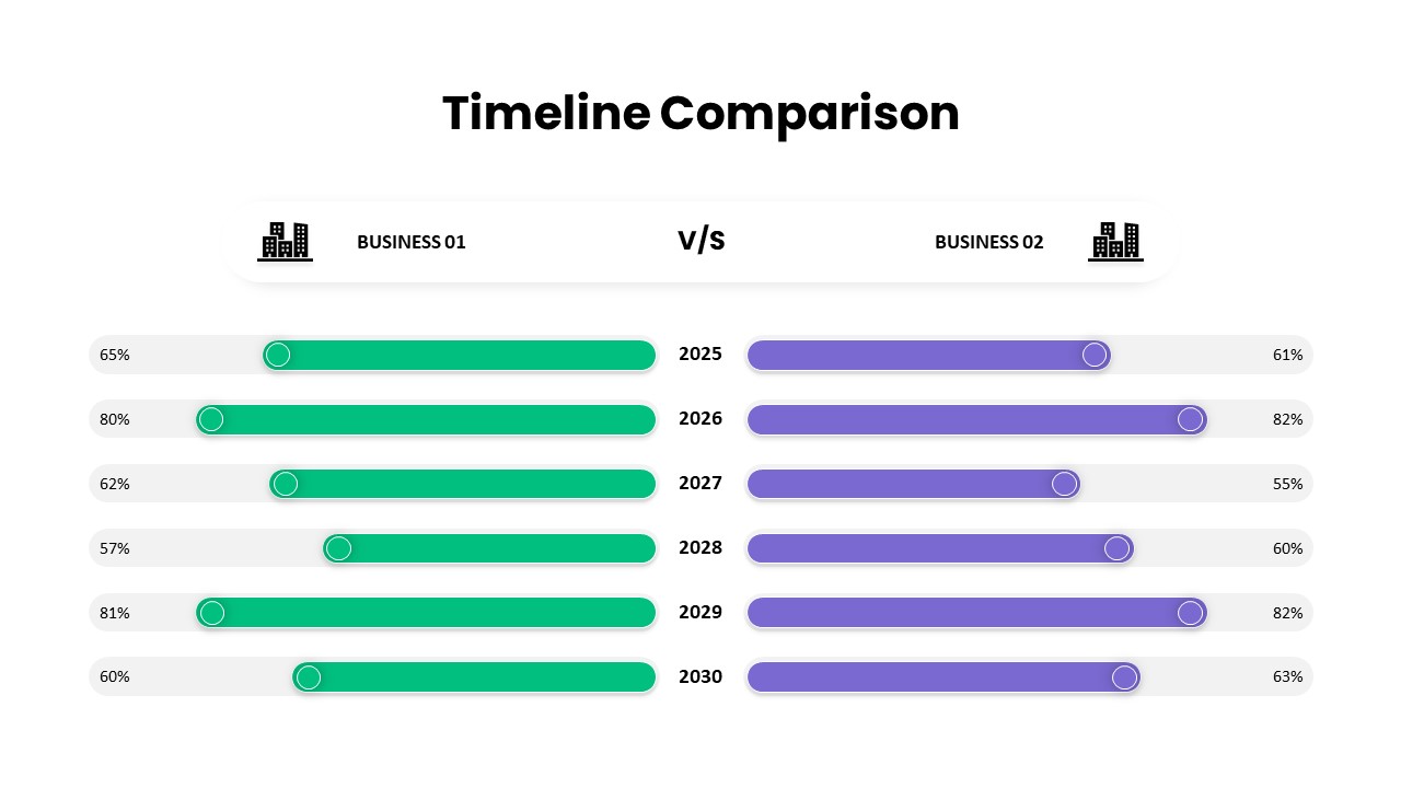
This slide presents a side-by-side timeline comparison bar chart that visualizes annual performance metrics for two businesses across six consecutive years (2025–2030). Each row features a light gray baseline with percentage labels at the start for Business 01, displayed in vibrant green, and at the end for Business 02, highlighted in bold purple. Circular markers indicate the starting point of each bar segment, while central year labels maintain clear alignment. The clean white background and thin axis lines ensure that key data remains prominent and uncluttered.
Fully built on editable master slides, this template allows seamless customization of color swatches, bar heights, fonts, and marker styles. Swap out percentage values or relabel year markers in seconds without disrupting the grid alignment. Use the slide master controls to adjust dotted or solid axis lines, modify baseline styling, or incorporate your corporate logo and brand fonts. All vector shapes and text placeholders are grouped logically, enabling rapid modifications for different presentation themes or regional requirements.
Optimized for both PowerPoint and Google Slides, this slide preserves pixel-perfect fidelity across desktop and cloud environments. The lightweight file structure minimizes load times and eliminates version-control conflicts when collaborating with distributed teams. Embed this bar chart within quarterly business reviews, investor briefings, or executive dashboards to convey comparative insights at a glance. Whether you are monitoring revenue variances, market-share shifts, or resource allocations, the intuitive layout accelerates stakeholder understanding and drives data-driven decision making.
Beyond corporate performance reviews, repurpose this timeline comparison for academic research, nonprofit impact assessments, or product benchmarking studies. Adjust the design to compare department KPIs, budget-versus-actual figures, or project milestone completions. Duplicate individual rows to incorporate additional business units or scenarios, and leverage color-coded markers to indicate threshold breaches or target achievements. With its flexible structure, this slide serves as a versatile asset for any scenario that requires concise, side-by-side comparative visualization of metrics over time.
Who is it for
Business analysts, financial planners, and operations managers will find this slide invaluable for presenting year-over-year performance comparisons between multiple entities. Strategic consultants, market researchers, and corporate executives can also leverage its clear, side-by-side format to highlight trends, variances, and competitive benchmarks in boardroom presentations or client workshops.
Other Uses
Use this template to compare sales targets versus actuals, departmental budget allocations, or customer satisfaction scores over time. Ideal for performance dashboards, semester-grade tracking, or grant funding analyses across multiple programs. Simply adjust the labels, colors, and markers to accommodate any two-series temporal comparison.
Login to download this file

Item ID
SB03647