


3d Cylinder Bar Chart
Description
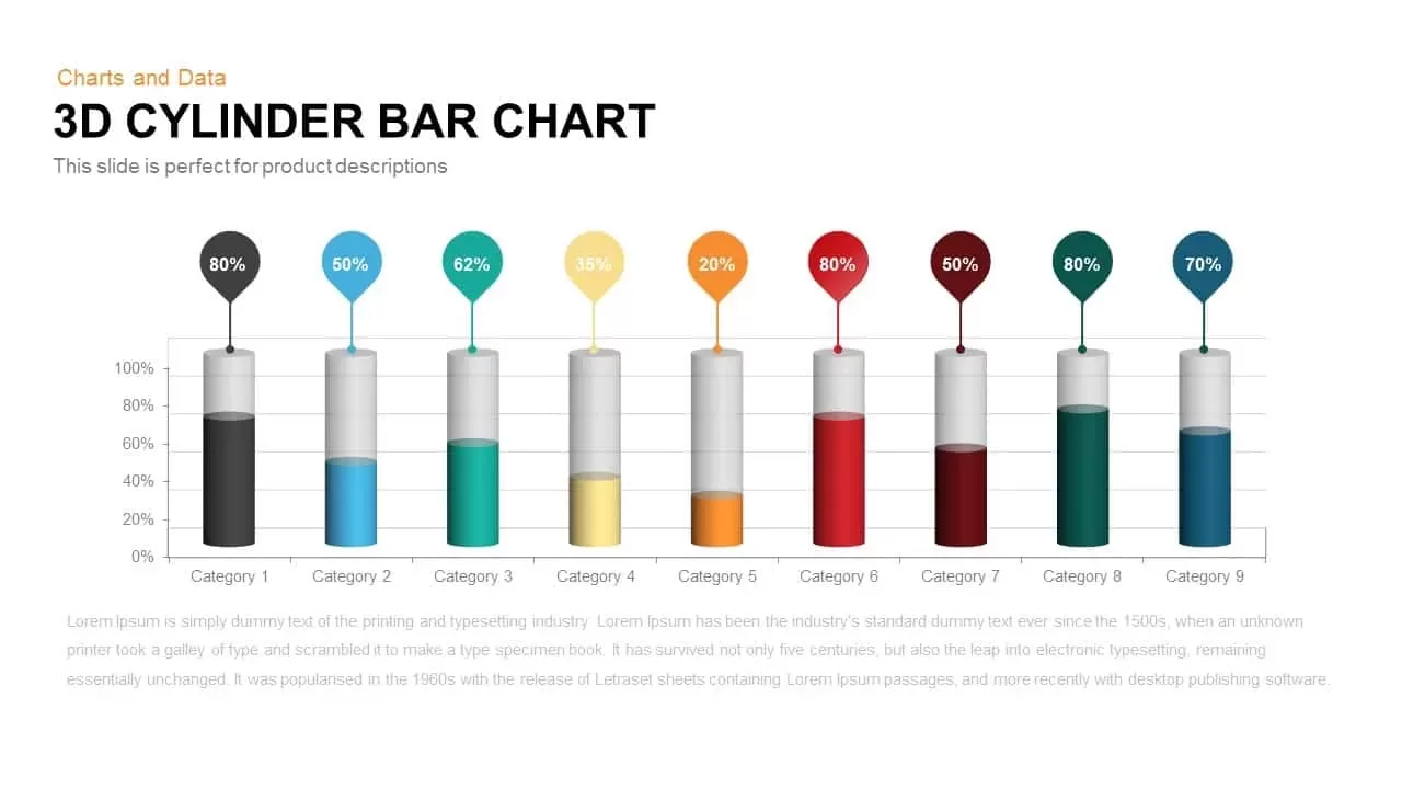
Leverage this 3D cylinder bar chart slide to present percentage-based performance metrics across multiple categories with striking visual depth and clarity. Each cylinder uses gradient shading and a pin label to display percentage values (ranging from 20% to 80%) above the top, while the remaining portion is rendered in a neutral gray tone—creating an immediate contrast that guides the audience’s focus to key data points. With nine customizable categories, you can compare regional sales, product adoption, project completion rates, or any KPI of your choice in a single, cohesive layout.
This slide is designed on master templates for PowerPoint and Google Slides, ensuring seamless theme integration, consistent typography, and easy editing. All cylinder elements are vector-based, allowing you to resize, recolor, or adjust gradient fills without loss of quality. Pin callouts feature clear, bold labels that hover above each cylinder, improving data readability and reinforcing your narrative. The underlying grid offers subtle guidance for precise alignment, while ample white space around the chart maintains a clean, uncluttered aesthetic.
Flexibility is at the core of this asset: swap the percentage values, modify category labels, or change gradient colors in seconds to align with your brand palette. Whether you’re reporting on quarterly performance, comparing department efficiencies, or highlighting survey results, this slide communicates complex information with maximum impact and minimal effort. The 3D effect adds dimension and modern flair, helping your presentation stand out in boardrooms, stakeholder meetings, or external pitches.
Optimized for both desktop and cloud-based presentations, this chart guarantees consistent rendering across devices, eliminating formatting headaches and ensuring your insights translate perfectly from screen to screen.
Who is it for
Sales managers, product marketers, and business analysts who need to showcase segmented performance data and compare key metrics at a glance. Executives, data consultants, and strategic planners can leverage this chart to drive data-driven decision making and align stakeholder perspectives.
Other Uses
Beyond sales and product dashboards, repurpose this slide to visualize budget allocations, track survey results, illustrate A/B test outcomes, or compare project milestone completions. Adapt the gradient cylinders to highlight resource utilization, market segment shares, or departmental KPIs.
Login to download this file

Item ID
SB00218