


Combination Chart infographic PowerPoint
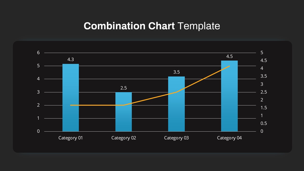
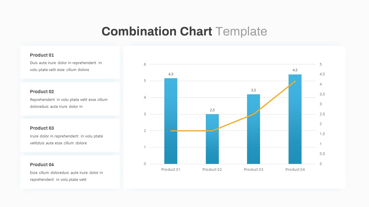
Leverage this versatile combination bar and line chart slide to present dual-metric comparisons with professional clarity. The template features a bold, full-width chart area where gradient blue bars represent discrete category values—4.3, 2.5, 3.5, and 4.5—alongside a contrasting orange line series that traces a secondary trend axis. Gridlines and dual vertical scales ensure accuracy when mapping two data sets on one visual, while clear numeric labels atop each bar provide instant value recognition. This slide also includes optional left-hand text panels for descriptive callouts, allowing presenters to summarize Product 01 through Product 04 insights in concise, editable text boxes.
All chart elements are built on a master-slide framework in PowerPoint and Google Slides, meaning you can effortlessly swap data points, adjust axis ranges, recolor gradients, and modify legend positioning without disrupting the underlying design. The clean sans-serif fonts and generous white space direct audience focus to the data itself, while the subtle drop shadows on bars and panels add depth and visual hierarchy. No external plugins are required—simply update your data in the chart’s embedded table, and the graphics will refresh automatically.
Designed for maximum adaptability, this combination chart slide serves as both a standalone data visualization and as part of larger dashboards or financial reports. Use it to track year-over-year performance, compare sales and profitability, illustrate customer satisfaction versus volume, or overlay operational metrics against strategic KPIs. The balanced layout retains full resolution across screens and projectors, ensuring your presentation looks crisp in boardrooms, webinars, or on high-definition displays. Apply simple entrance animations to bars or the line series to sequentially build your narrative and guide viewer attention during live sessions.
Who is it for
Financial analysts, marketing managers, and business intelligence professionals will benefit from this slide when comparing multiple metrics across categories or illustrating trends alongside discrete values.
Other Uses
Repurpose this template for revenue versus cost analyses, budget vs. actual reports, product feature adoption rates with satisfaction scores, or any scenario requiring simultaneous bar and line data visualization.
Login to download this file
Add to favorites
Add to collection

Item ID
SB03616