


Donut Diagram PowerPoint Template
Description
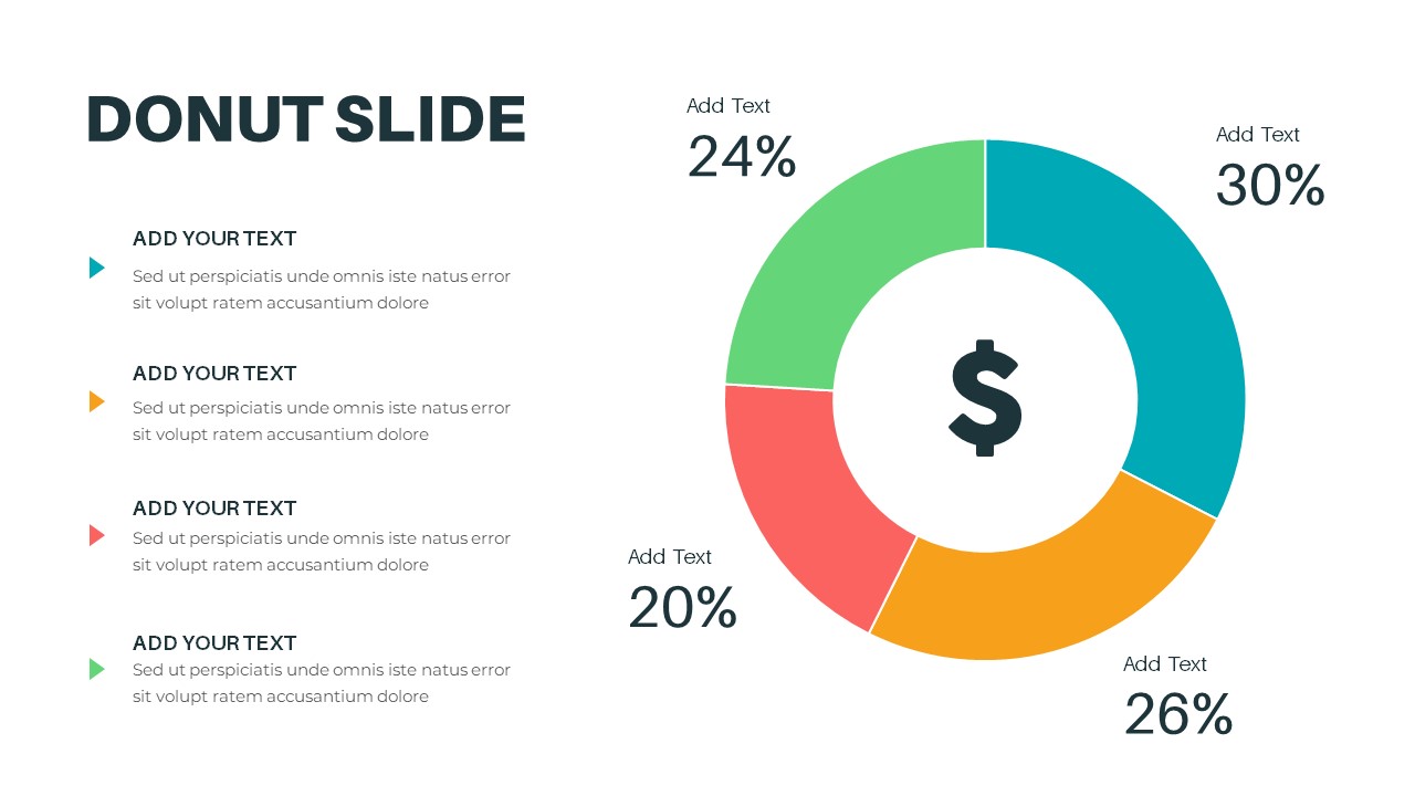
This "Donut Slide" offers a clean and engaging way to present percentage-based data or proportions using a circular donut chart. The slide includes four distinct segments, each with customizable text boxes and percentages, ideal for showing how different parts contribute to the whole. The chart features a central icon of a dollar sign, making it particularly useful for financial presentations, budgets, sales breakdowns, or market share analysis.
The colors—green, teal, orange, and red—allow for easy differentiation between each segment, helping your audience quickly grasp the relative size of each portion. This minimalist design, combined with a simple but effective chart, ensures your data is presented clearly and professionally.
The slide is fully editable, allowing you to modify text, adjust percentages, and even replace the central icon to better suit your specific content. Whether you're discussing financial performance, product sales, or other data-driven topics, this donut chart provides an attractive and efficient way to communicate information in both PowerPoint and Google Slides.
Who is it for
This slide is perfect for financial analysts, business executives, marketers, and anyone in need of presenting quantitative data. It's ideal for reporting, budget analysis, sales breakdowns, or any situation that requires the visualization of proportions or market share.
Other Uses
Besides finance-related topics, this slide can be adapted for use in project status reports, resource allocation, or any comparison involving multiple parts of a whole. It is also useful in marketing presentations for showing campaign performance or in operations to demonstrate resource distribution.
Login to download this file

Item ID
SB03232