


Donut Chart PowerPoint Template Dark
Description
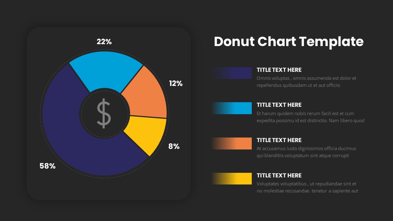
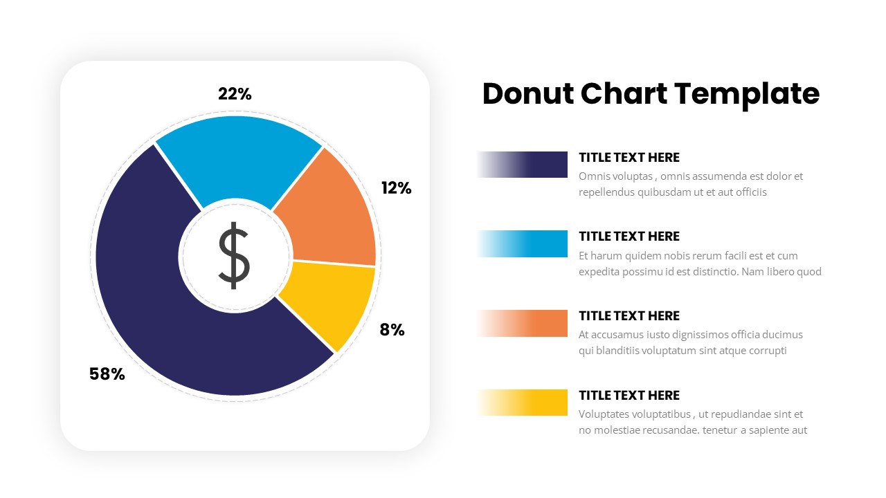
The "Donut Chart" slide provides a sleek and engaging way to display data in a circular format, with each segment representing a different category or value. The chart is divided into four sections, each with distinct colors—blue, yellow, orange, and purple—showcasing their respective percentages (58%, 22%, 12%, and 8%). The central area of the chart includes a dollar sign icon, making it ideal for financial or budget-related presentations.
This slide is perfect for comparing different categories, product sales, market shares, or performance metrics. Its vibrant colors and clean design make the information easy to read and visually appealing. The layout also includes space for accompanying text, so you can provide more context or explain each segment in detail.
Fully editable, this slide allows you to adjust the percentages, text, and color scheme to suit your needs. It works seamlessly in both PowerPoint and Google Slides, offering flexibility and customization for your data visualization needs.
Who is it for
This slide is ideal for financial analysts, marketers, product managers, and business professionals who need to present comparative data in a clear and engaging format. It's perfect for reporting on sales performance, budget breakdowns, or any scenario that involves proportional data visualization.
Other Uses
Beyond financial presentations, this slide can be used to show survey results, resource allocation, customer segmentation, or project task distribution. It is also effective in visualizing progress or milestones in a project, making it a versatile tool for various industries and business needs.
Login to download this file

Item ID
SB03240