


Statistic Infographic
Description
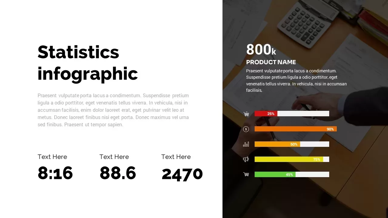
Optimize your data storytelling with this professional Statistics Infographic slide for PowerPoint & Google Slides. The layout features a two-series bar chart across four categories, with bold red, orange, yellow, and green bars representing comparative metrics and percentage callouts for quick insight. Each bar aligns with a vector icon—shopping cart, currency symbol, performance chart, megaphone, and analytics indicator—adding context to data points such as sales ratios, cost benchmarks, engagement levels, and campaign metrics. Generous white space and minimalist sans-serif typography ensure clarity on both desktop and large-format projections, while a subtle background image behind the data panel adds depth without distraction. The template includes editable percentage labels, descriptive text areas, and icon-driven callouts to emphasize critical trends. Vector shapes guarantee crisp rendering at any resolution, and optional data labels support audience comprehension at a glance.
Built on slide masters, this template lets you swap colors, adjust axis labels, and update chart values via native chart tools in seconds, preserving consistent styling across your deck. Additional KPI callouts beneath the main chart highlight key performance indicators with large numeric displays—such as time ratios, index values, and total units—providing a concise summary for stakeholders. Use drop-in icons from your brand library, link live data sources for automatic updates, or hide unused elements for a streamlined look. Whether you’re presenting quarterly sales distributions, marketing performance reviews, or financial benchmarks, this slide transforms complex statistics into an engaging visual narrative that drives data-driven conversations. Export individual chart segments as standalone graphics for reports or collaborate in real time on Google Slides to refine insights with your team. With its modular design and professional polish, this Statistics Infographic template elevates every presentation from informative to impactful.
Who is it for
Data analysts, marketing managers, financial planners, and business consultants who need a high-impact slide to present percentage comparisons, KPI metrics, and survey results to stakeholders, executives, or clients.
Other Uses
Repurpose this versatile infographic to illustrate resource allocations, budget forecasts, customer satisfaction scores, risk assessments, or any scenario requiring clear, color-coded comparisons of multiple data series.
Login to download this file

Item ID
SB03032