


Statistics Infographic
Description
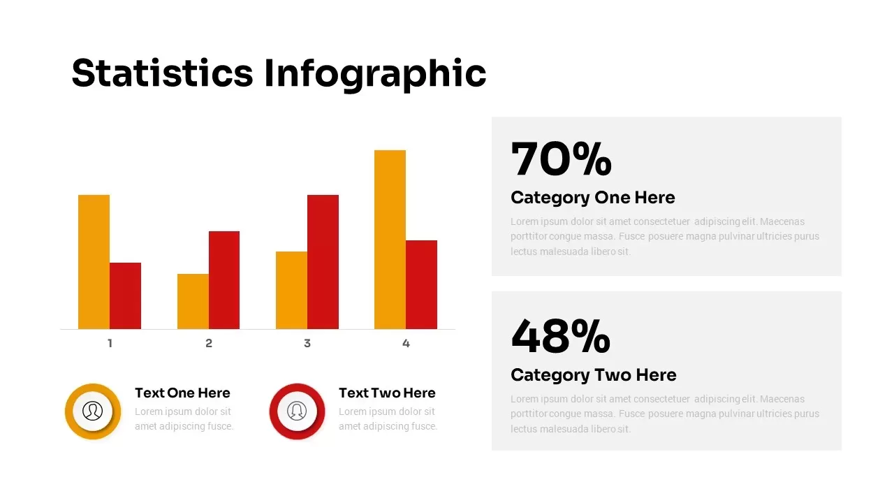
Visualize comparative metrics with precision using this Statistics Infographic & KPI Bar Chart slide template for PowerPoint & Google Slides. The clean white canvas hosts a two-series bar chart across four categories, with bold yellow and red bars that instantly draw attention to your key data points. Each axis label and gridline is easily editable, ensuring that your audience can follow the progression from Category 1 through Category 4 at a glance. Below the chart, paired icon placeholders and text zones let you highlight two critical insights or team attributions, while separate callout panels on the right showcase large percentage figures—70% for Category One and 48% for Category Two—accompanied by concise explanatory text. Subtle drop shadows and generous white space maintain a minimalist aesthetic, keeping the focus squarely on your statistics without visual clutter.
Engineered for seamless customization, this template leverages PowerPoint and Google Slides’ native chart tools, alignment guides, and master slide support. Swap out the default yellow and red accents for your brand palette in seconds, or duplicate the bar groups to extend the chart to additional categories. The callout panels and icon placeholders can be repositioned, recolored, or relabeled to suit KPI tracking, campaign performance, or survey result breakdowns. Whether you need to present quarterly sales distributions, market-share comparisons, or performance benchmarks, this modular slide preserves its professional structure from desktop displays to large-scale projections. Export selected elements as standalone graphics for handouts, embed live data links for real-time updates, or collaborate in Google Slides to refine your narrative at the speed of thought.
Who is it for
Data analysts, marketing managers, financial planners, and business consultants who need a high-impact slide to present percentage comparisons and KPI metrics in corporate boardrooms, client pitches, or executive briefings.
Other Uses
Repurpose this versatile infographic to illustrate resource allocations, survey findings, budget forecasts, or operational performance across any four-category framework, from HR dashboards to product feature analyses.
Login to download this file
Add to favorites
Add to collection

Item ID
SB03027