


Heat Map Template for PowerPoint Dark
Description
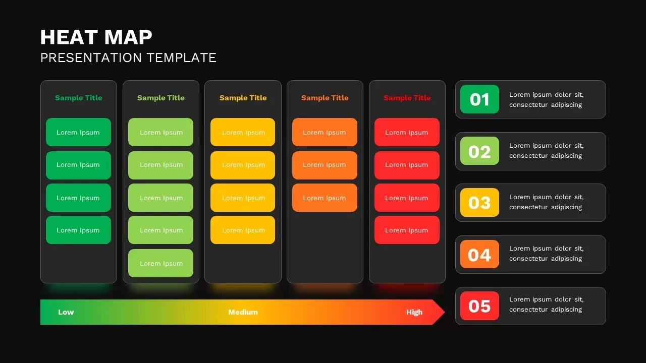
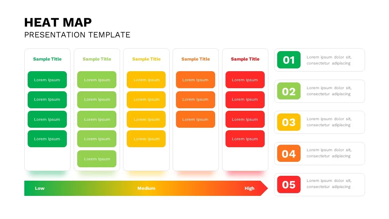
Leverage this dynamic heat map dashboard slide to present comparative intensity values across multiple categories with clarity and visual impact. Five vertical panels host rounded content cards whose hues transition—from cool green and light green through yellow and orange to warm red—signaling ascending levels of priority or performance. On the right, a corresponding numbered list (01–05) pairs each color with concise text placeholders, ensuring your key metrics or action items remain immediately legible. A full-width gradient arrow at the bottom anchors the design, mapping “Low” through “Medium” to “High” and reinforcing data context at a glance. Crafted with editable master layouts, this template features consistent typography, generous white space, and subtle drop shadows that maintain focus without clutter. Fully customizable in PowerPoint and Google Slides, each card, text field, and color stop can be adapted in seconds to align with corporate branding or project-specific palettes. Whether you’re highlighting risk assessments, customer satisfaction scores, or performance benchmarks, this slide streamlines complex data into a visually intuitive format that drives stakeholder engagement and informed decision-making.
Who is it for
Business analysts, project managers, and data-driven leaders will benefit from this heat map dashboard when illustrating performance trends, risk levels, or resource allocations. Consultants, marketing teams, and C-level executives can leverage its clear color scale to guide strategic discussions and boardroom presentations.
Other Uses
Beyond status reporting, repurpose this slide to visualize customer journey heat maps, sales territory performance, survey response intensity, or process bottlenecks. Duplicate panels to expand categories or invert the gradient to illustrate decline metrics, making this layout a versatile asset across industries.
Login to download this file

Item ID
SB02915