


Heat Map PowerPoint Template Dark
Description
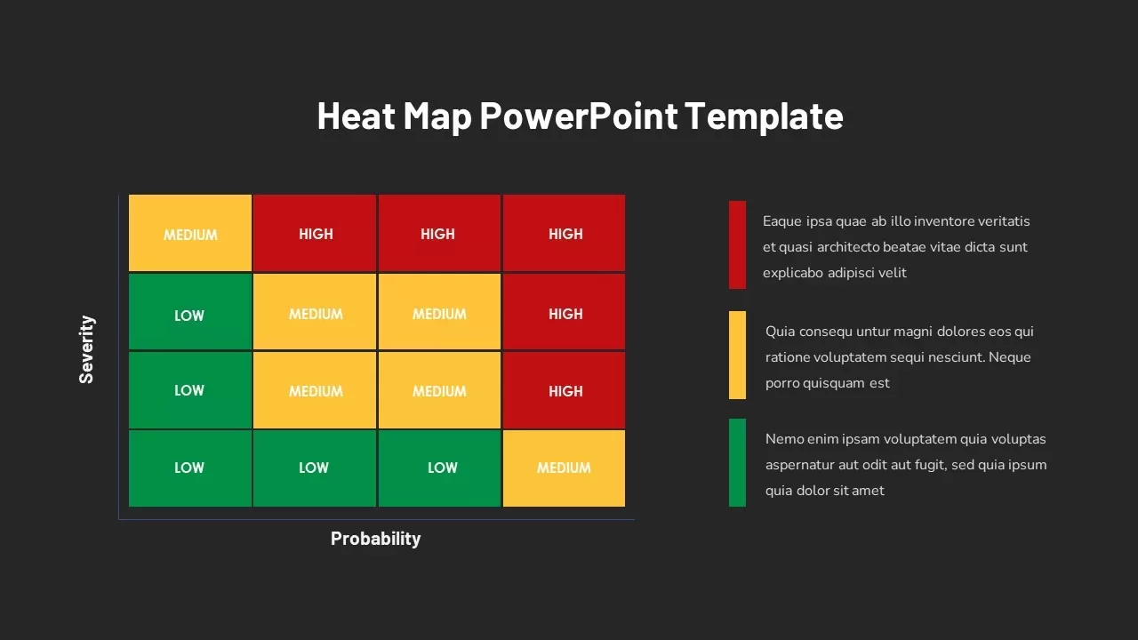
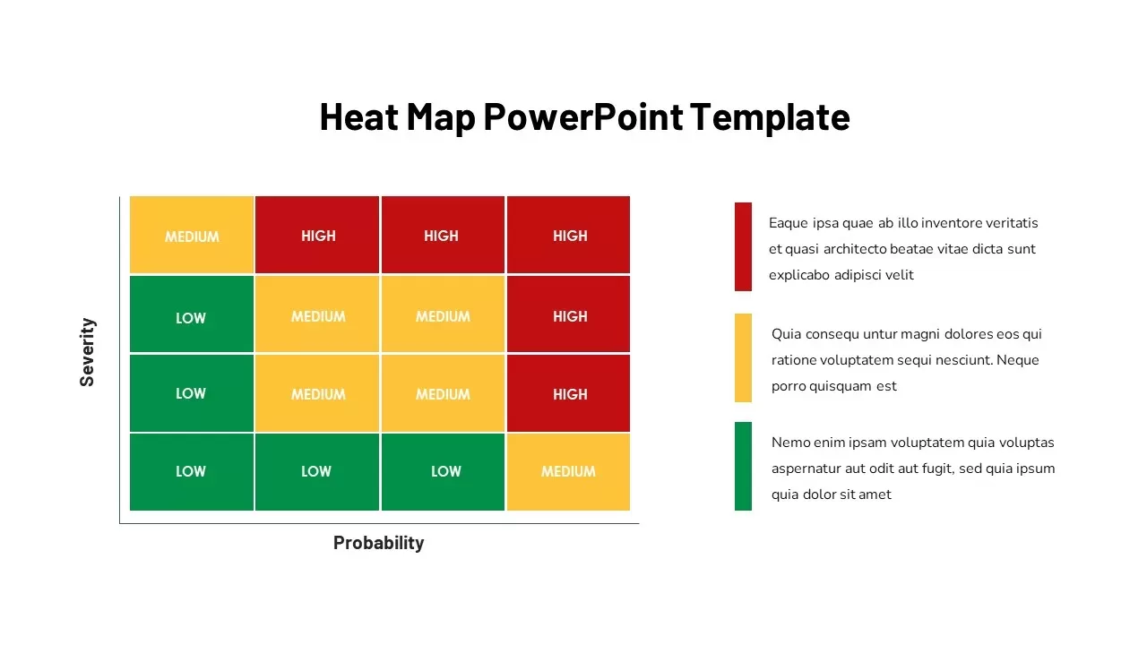
This Heat Map Slide provides a visually engaging and easy-to-understand matrix for assessing risk factors based on severity and probability. The slide uses color coding—green for low risk, yellow for medium risk, and red for high risk—to help prioritize actions or decisions based on a combination of these two key factors. The template is perfect for risk assessment, project management, or decision-making presentations where clear visual representations are needed.
The heat map is organized with severity listed on the vertical axis and probability on the horizontal axis, offering a clear representation of data. Each box is customizable, allowing you to input relevant text or data specific to your analysis. The template is fully editable and adaptable, making it a versatile tool for different industries, including project management, marketing, and business strategy.
Who is it for
This template is ideal for project managers, risk analysts, business leaders, or anyone involved in risk assessment or strategic decision-making. It’s perfect for corporate executives, consultants, or anyone preparing presentations that require easy-to-read and compelling visual aids.
Other Uses
Beyond risk management, this heat map can be repurposed for visualizing priorities, customer satisfaction analysis, product development roadmaps, or any other data set that involves a two-factor comparison. It's useful for prioritizing tasks, identifying key performance areas, or displaying survey results, among other applications.
Login to download this file

Item ID
SB02890