3d Bar Chart Infographics Powerpoint Keynote template
Description
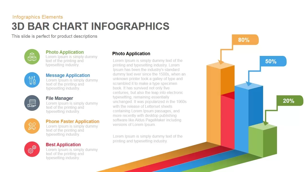
This slide presents a vibrant 3D bar chart infographic with product icon callouts on a clean white canvas. On the right, three towering bars in contrasting orange, blue, and green heights represent comparative metrics—80%, 50%, and 20%, respectively—each topped with arrowed percentage labels for immediate data recognition. The bars cast dynamic isometric shadows across the base plane, reinforcing depth and guiding the viewer’s eye. On the left, a vertical list of five colored icons—depicting Photo Application, Message Application, File Manager, Phone Faster Application, and Best Application—provides contextual anchors, each paired with brief descriptive text. A central text panel accommodates a detailed narrative section, offering space for comprehensive analysis, product overviews, or performance summaries with master-slide-enabled formatting.
The template also includes a built-in legend at the chart base that correlates each bar’s color with its data series name. You can toggle legend visibility or reposition it for optimal layout alignment. Vector shapes guarantee crisp quality on high-resolution screens, while master slide controls allow for global theme updates across your presentation. Alignment guides and distribution tools facilitate adding or removing data series and icons without disrupting the overall layout. The clean sans-serif typography maintains professional clarity, while ample white space highlights the infographic’s structural elements.
For enhanced presentation impact, apply sequential entrance animations to bars and callouts, drawing attention to each metric as it appears. This versatile design supports both 16:9 and 4:3 aspect ratios, ensuring consistent formatting across screens, projectors, and printed handouts. Whether showcasing sales performance, adoption rates, or feature comparisons, this 3D bar chart infographic slide offers the flexibility and visual appeal needed to communicate complex information effectively.
Who is it for
Marketing managers, product managers, and data analysts will leverage this slide to present comparative performance metrics, feature adoption rates, and product usage insights. Sales leaders and consultants can adapt it for quarterly reviews, pitch decks, and investor updates.
Other Uses
Repurpose this layout for financial dashboards, KPI tracking, or customer satisfaction surveys. Replace icons and bar values to illustrate resource allocation, survey results, or departmental performance across teams.
Login to download this file
Add to favorites
Add to collection


