


Pros And Cons Seesaw PowerPoint Template
Description
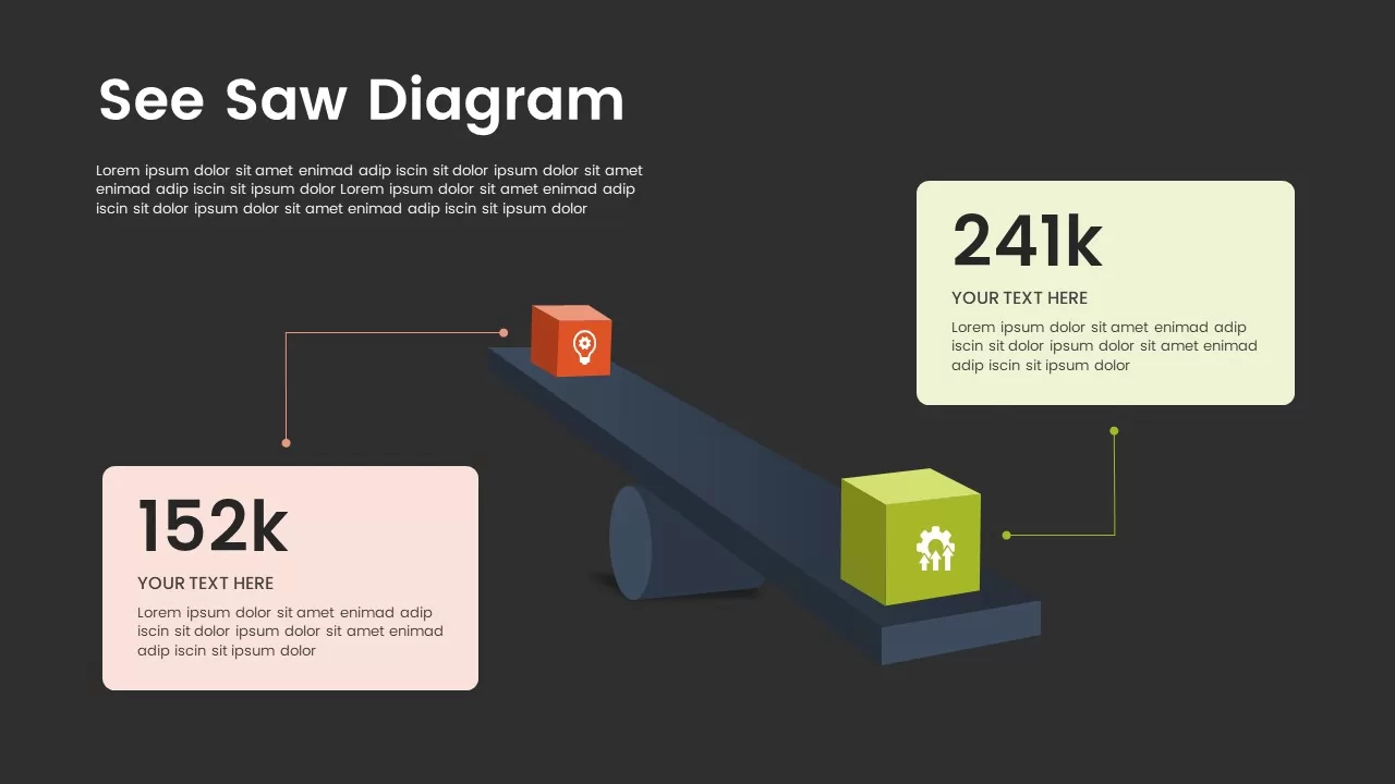
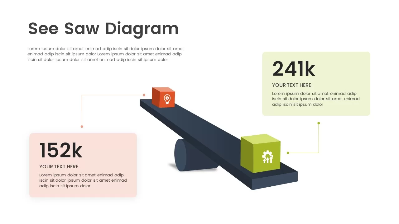
This innovative seesaw diagram infographic effectively visualizes comparisons and contrasts between two categories or datasets. The balanced structure, with icons and colorful text boxes on each side of the seesaw, allows you to clearly present information and compare key metrics. The diagram is ideal for highlighting opposites, such as budget vs. performance, or gains vs. losses, in a visually engaging manner.
In the first slide, the seesaw diagram shows two categories—each with an associated value—helping to convey a sense of balance and equilibrium between the items. The second slide continues with additional customization, enabling you to display more detailed data, such as performance metrics, percentages, or growth comparisons. The icons, placed above the data points, help clarify the context, while the clean, minimalist design keeps the focus on the core information.
Fully customizable, this infographic allows you to replace the example text and numbers with your own, making it adaptable for a variety of uses, from business reports and financial analysis to project management and marketing presentations.
Who is it for
This infographic is perfect for business analysts, project managers, marketers, and financial planners who need to compare two variables or datasets. It is useful for reports, presentations, and meetings where visual comparisons can drive a stronger understanding of key performance indicators or metrics.
Other Uses
In addition to business and marketing applications, this infographic can be repurposed for educational purposes, such as comparing research results, tracking progress, or displaying any kind of paired data for easier analysis. It can also be adapted for personal use, such as comparing personal goals or project timelines.
Login to download this file
Add to favorites
Add to collection

Item ID
SB02278