


3D Spheres Fill Levels Template 13
Description
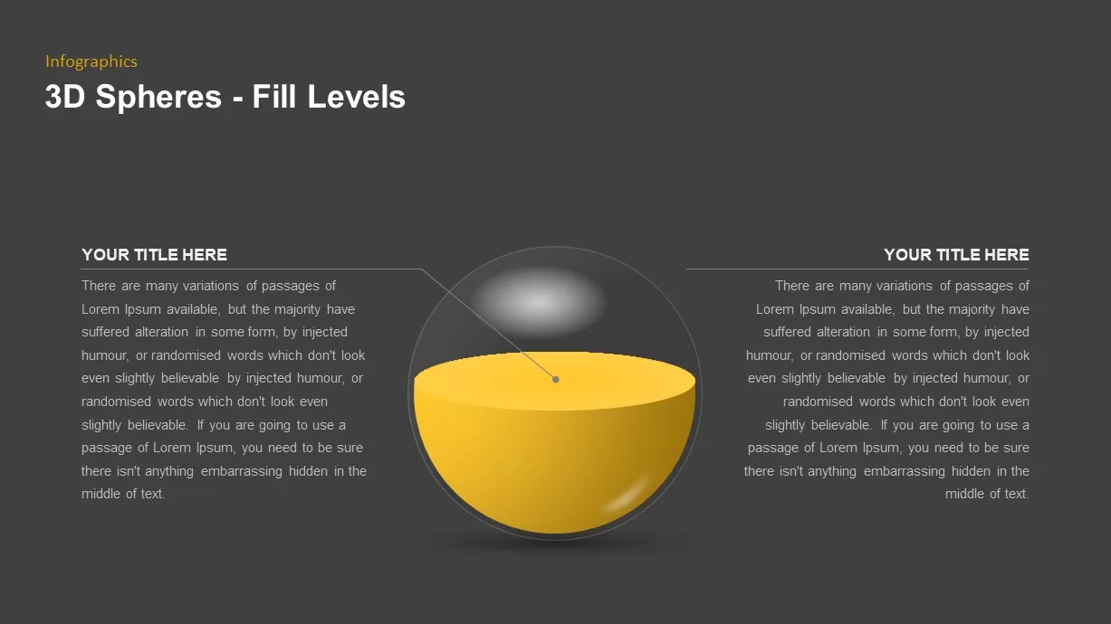
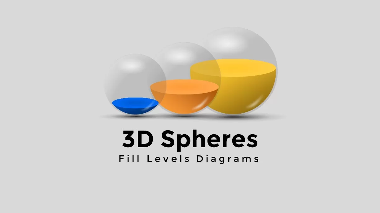
This 3D Spheres Fill Level Infographic Deck features ten versatile slides showcasing semi-transparent spheres partially filled with vibrant liquid layers—blue, yellow, orange, red, and teal—to represent percentage or capacity values. The collection includes a full-width comparative chart with gridlines and labels, a central spotlight diagram with four callouts, a horizontal progression of five fill-level spheres, and modular layouts combining a main sphere with three smaller data points. All graphics are built from editable vector shapes on master slides, allowing you to adjust fill percentages, swap colors, change text, and resize without loss of quality. Subtle drop shadows and highlights create a realistic 3D effect, while clean typography and consistent alignment guides ensure a polished professional look.
Who is it for
Data analysts, marketing professionals, and project managers will use these 3D sphere diagrams to present survey results, resource utilization, KPI achievements, or progress milestones. Trainers and consultants can leverage the eye-catching visuals to reinforce key metrics during workshops and briefings.
Other Uses
Beyond percentage displays, repurpose these spheres for capacity planning, budget allocation breakdowns, risk level indicators, or comparative performance snapshots. The modular layouts also suit dashboards, executive summaries, and digital reports.
Login to download this file

Item ID
SB01692