Gantt Charts in PowerPoint: What, Why, How?

Have you ever heard of the Gantt Chart? Anyone who has ever had to manage several projects, due dates, and dependencies can attest to a well-structured plan. Here comes the Gantt chart, a tried-and-true project management tool that translates complex schedules into a visually clear and concise format. It helps in the planning, management, and defining the sequence or time period of a project or task.
In this article you will learn about what is a Gantt chart, why they are important, and finally to create a Gantt chart in PowerPoint.
What is a Gantt Chart?
A Gantt chart, created by Henry Gantt in the early 1900s, is a bar chart that shows the timeline for a project. Tasks are usually shown on a horizontal axis, and time intervals (days, weeks, or months) are shown on a vertical axis. A horizontal bar that represents each task and whose length corresponds to its duration is used
Gantt charts can be made in a number of ways with PowerPoint. You can use its built-in forms and charting features to create an efficient visual representation of your project timeline, even if it lacks a dedicated Gantt chart tool. Alternatively, there are many Gantt chart PowerPoint templates widely available across the web.
Why Use a Gantt Chart?
Gantt charts offer a multitude of benefits for project managers and team members alike. Let’s see why they are important in project management:
- Communication and Clarity: Complicated project timetables can be stressful. A Gantt chart provides a clear visual summary of activities, deadlines, and dependencies, which facilitates communication. As a result, stakeholders and team members are more understanding of one another.
- Planning and Scheduling: Gantt charts facilitate early identification of possible difficulties and constraints by providing a visual representation of the project timetable. This enables defensive plan modifications, guaranteeing more seamless project execution.
- Tracking and Monitoring: Gantt charts are a useful tool for tracking the progress of a project. You can identify variations in the schedule and, if necessary, take protective action by comparing the completed tasks, indicated by the filled section of the bar, with the overall timetable.
- Accountability and Collaboration: By keeping everyone informed about due dates and task ownership, a shared Gantt chart promotes greater accountability and collaboration. Team members have a sense of accountability as a result.
- Flexibility and Customization: You can quickly add colors, shapes, and text to Gantt charts in PowerPoint to emphasize significant dates, dependencies, or resource allocations. This adaptability enables you to customize the chart to your own project requirements.
How To Create a Gantt Chart in PowerPoint
Now you know what the Gantt chart is and why it is important.
This comprehensive guide provides step-by-step instructions on creating a professional Gantt chart in PowerPoint.
Get Your Data Ready: Gather all the project details you require before getting into PowerPoint. A list of the tasks, their durations, their start and end dates, and any dependencies between them are all included.
Let’s get started by opening PowerPoint and creating a blank presentation.
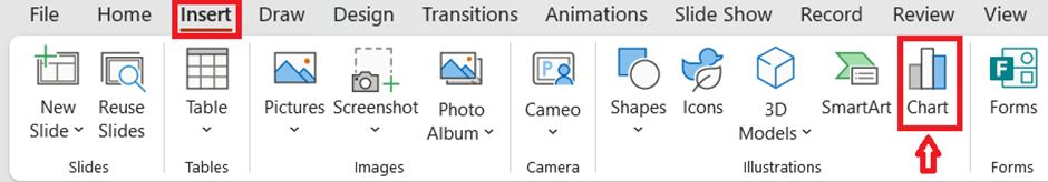
Then Go to the “Insert” tab and select “Chart” from the ribbon.
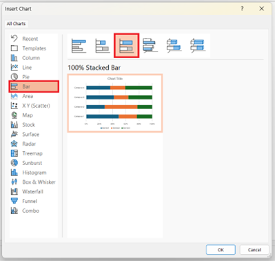
And choose the “Bar” category and then select the “Stacked Bar” chart type.
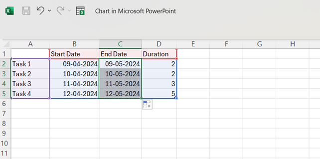
After creating a stacked bar chart, you must fill the excel table with project tasks, their due dates, and duration.
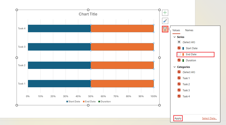
You can then format your Stacked Bar chart and turn it into a Gantt chart for PowerPoint. For that
a. Click on the filter icon at the right side of the stacked bar chart.
b. Unmark the “End date” checkbox.
c. Click the “Apply” button.
c. Click the “Apply” button
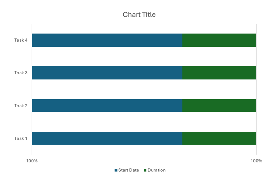
That’s it! Now the chart will look like this.
Taking it a Step Further
While the above methods provide a solid foundation for creating Gantt charts in PowerPoint, consider this additional tip for a more professional and impactful presentation:
- Utilize Templates: Explore online resources or add-ins for PowerPoint that offer pre-designed Gantt chart PowerPoint templates. These templates can save you time and effort in formatting.
To Conclude:
Gantt charts are powerful tools that can transform your project management from stressful to streamlined. They offer a clear visual representation of your project timeline, promoting communication, facilitating planning, and empowering you to track progress and hold everyone accountable. Now that you’ve learned the basics of creating Gantt charts in PowerPoint, you’re ready to take control of your projects and achieve success. So, gather your project details, fire up PowerPoint, and get ready to create a Gantt chart that will keep your team on track and your projects on target.